case study
How to redesigning
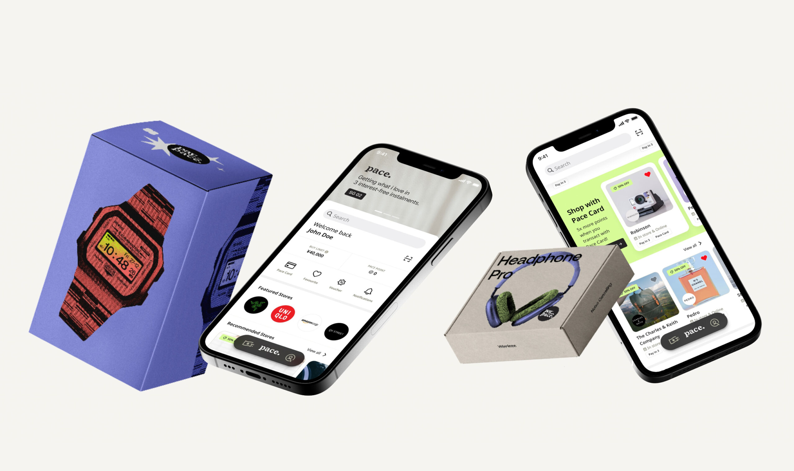
Buy Now Pay Later shopping experience
ROLE
Lead UX/UI Designer
responsibility
Market research, UX & UI design, project management
PROJECT TYPE
Product Design
ownership
Pacenow.co
ABOUT COMPANY
Pace Pay is a startup offering buy now, pay later (BNPL) payment solutions for in-store and e-commerce transactions. As lead product designer my goal is to redefine and redesign the Pace Pay app to align with company objectives and improve the overall BNPL experience.
Currently Pace Pay has disolve and stop their operations in all regions
Background
Why Redesign?
After six months of the product being released, we have gained insights into customer behavior, market needs, and their challenges. While the app worked with strong user base, there were challenges that couldn’t be ignored. This redesign aims to address these challenges and enhance the 'buy now, pay later' experience for our customers.
Take a step back
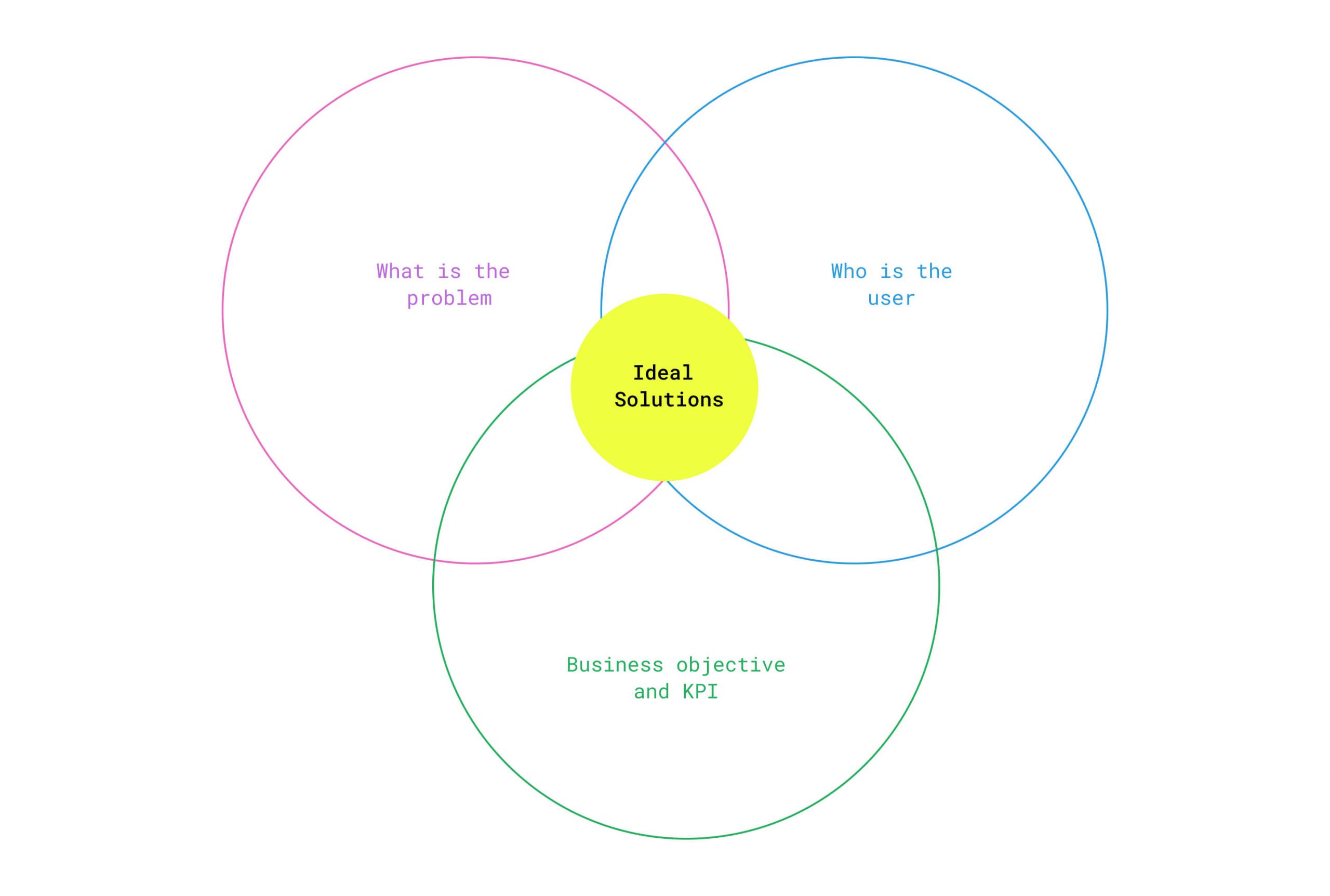
Before we could jump into solutions, we had to ask ourselves some questions:
- What does business objective from this project?
- What exactly is the problem we’re trying to solve?
- Who are our users, and what do they need?
The answers to those questions shaped everything that followed. We knew we needed a clear strategy, well-defined user personas, and a solid understanding of our business goals before any sketching or wireframing began.
Business objective
Based on the discussions with stakeholders, we set our primary objective of this redesign is to increase repeat transactions and reduce customer acquisition costs.
desire results
01. Increasing online transactions
Encourage users to complete purchases directly through the app or with the Pace Card for online shopping, offering a convenient and reliable payment experience.
02. Reduce reliance on vouchers
Users are motivated to make purchases not just because of discounts and vouchers, but because the overall experience with Pace is smooth, reliable, and enjoyable.
03. Go to payment method
We want user to use Pace App as and Pace Pay as their method for payment online and offlline (in-store).
Listening to the Data
Qualitative Research
We started by qualitative research to collect feedback. We reached out to users observing their behavior in the store, sending out email surveys, and having in-depth conversations with our most active customers.
The goal was to listen our user feedback directly, find out what people loved, what they tolerated, and what absolutely had to change from the experience.
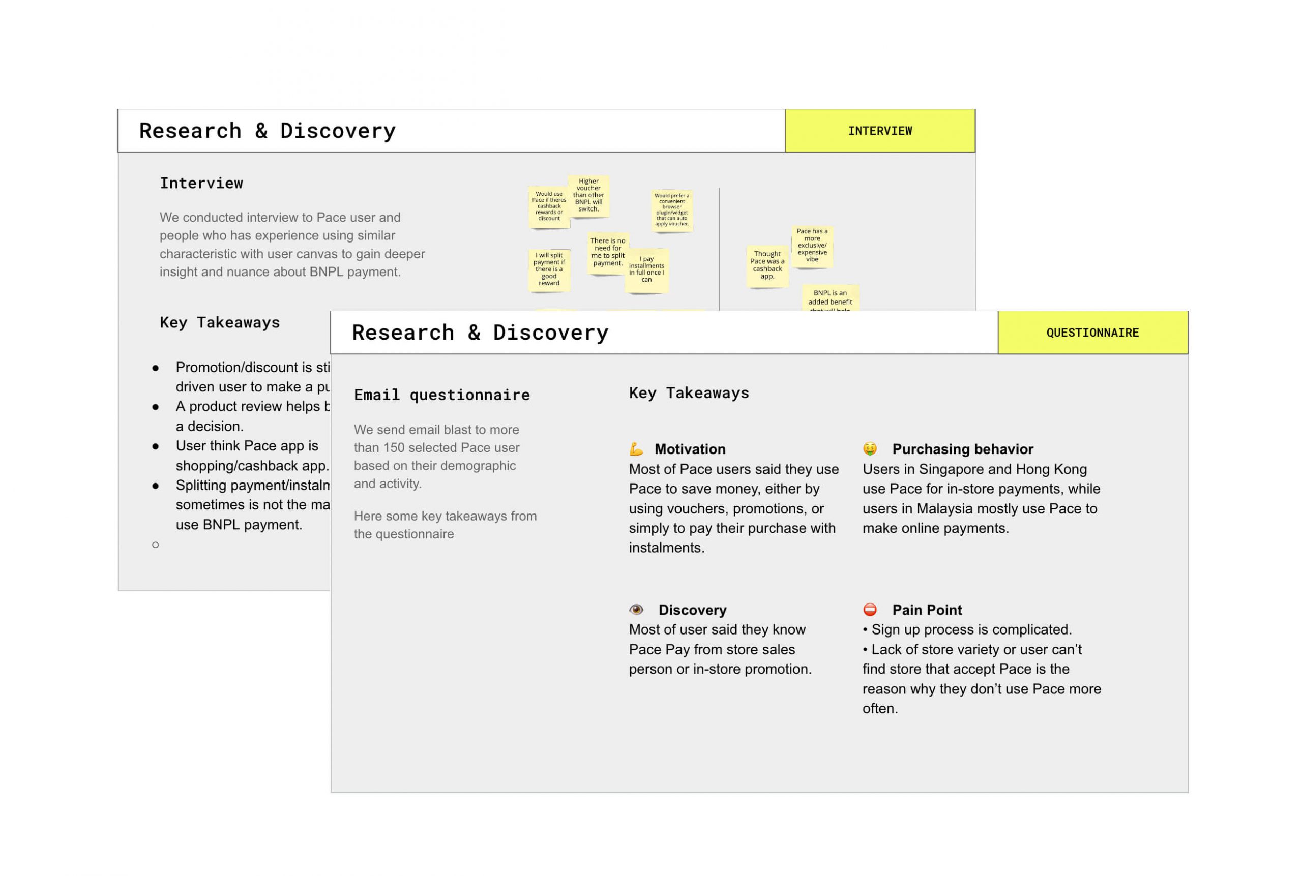
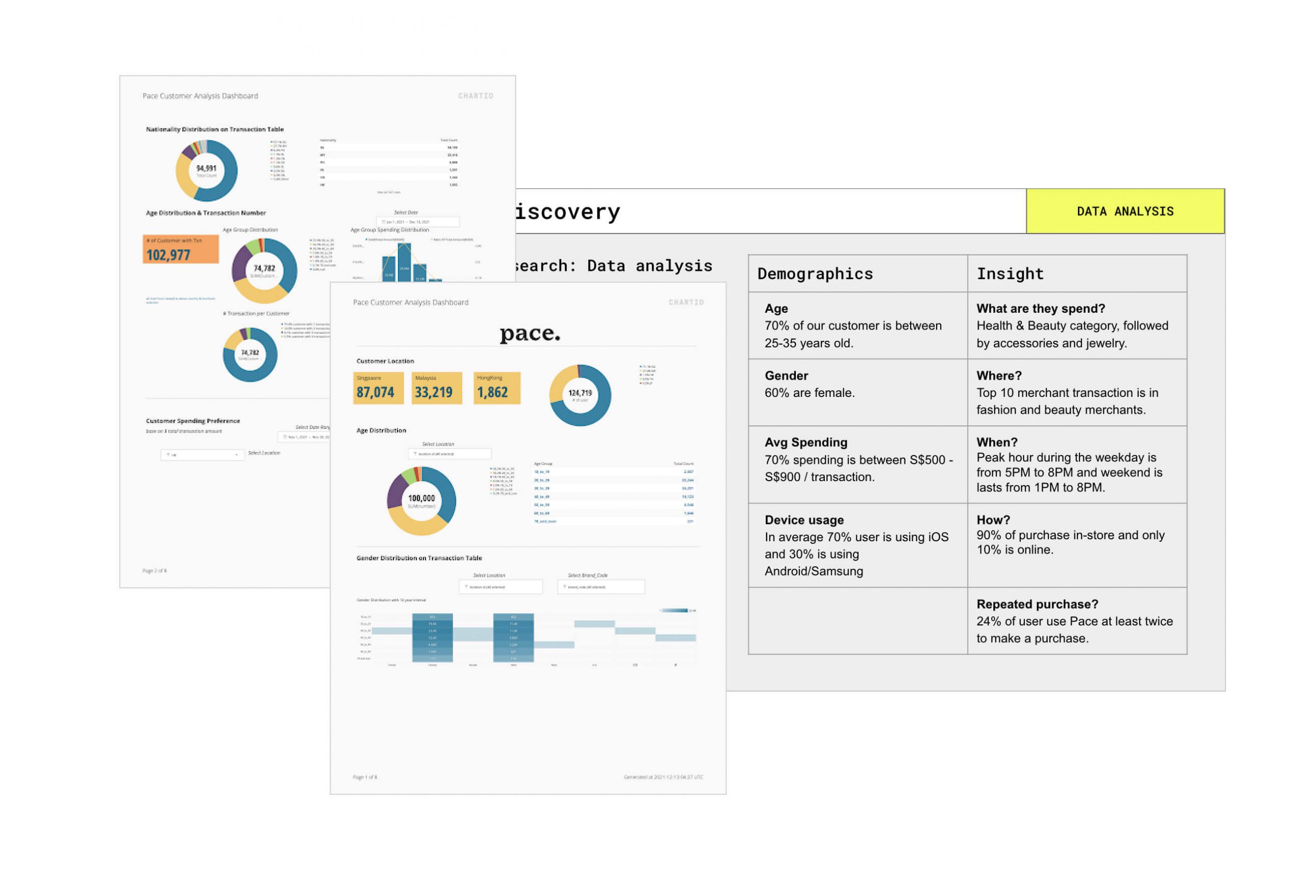
Quantitavie Research
We collaborated with the data team to analyze user activity, profiles, and behavior. This dataset provided valuable insights into user behavior and buying patterns, forming the foundation for our user personas and ideas how to improve the app.
We compiled this feedback and presented it to the stakeholders. These insights are invaluable not only to the product team but also to other departments within the organization.
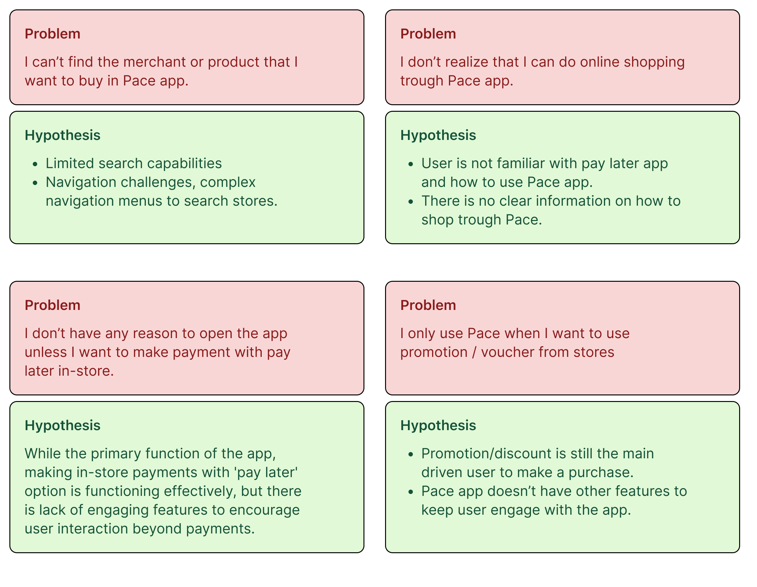
What we learned
Key Holistic Problems
Through our user research, we identified some clear patterns and challenges:
- Limited engagement beyond in-store transactions: Many users only open the app when making purchases at physical stores.
- Lack of awareness about online options: A large portion of users don’t realize the Pace app can be used for online shopping, which significantly reduces potential transaction volumes.
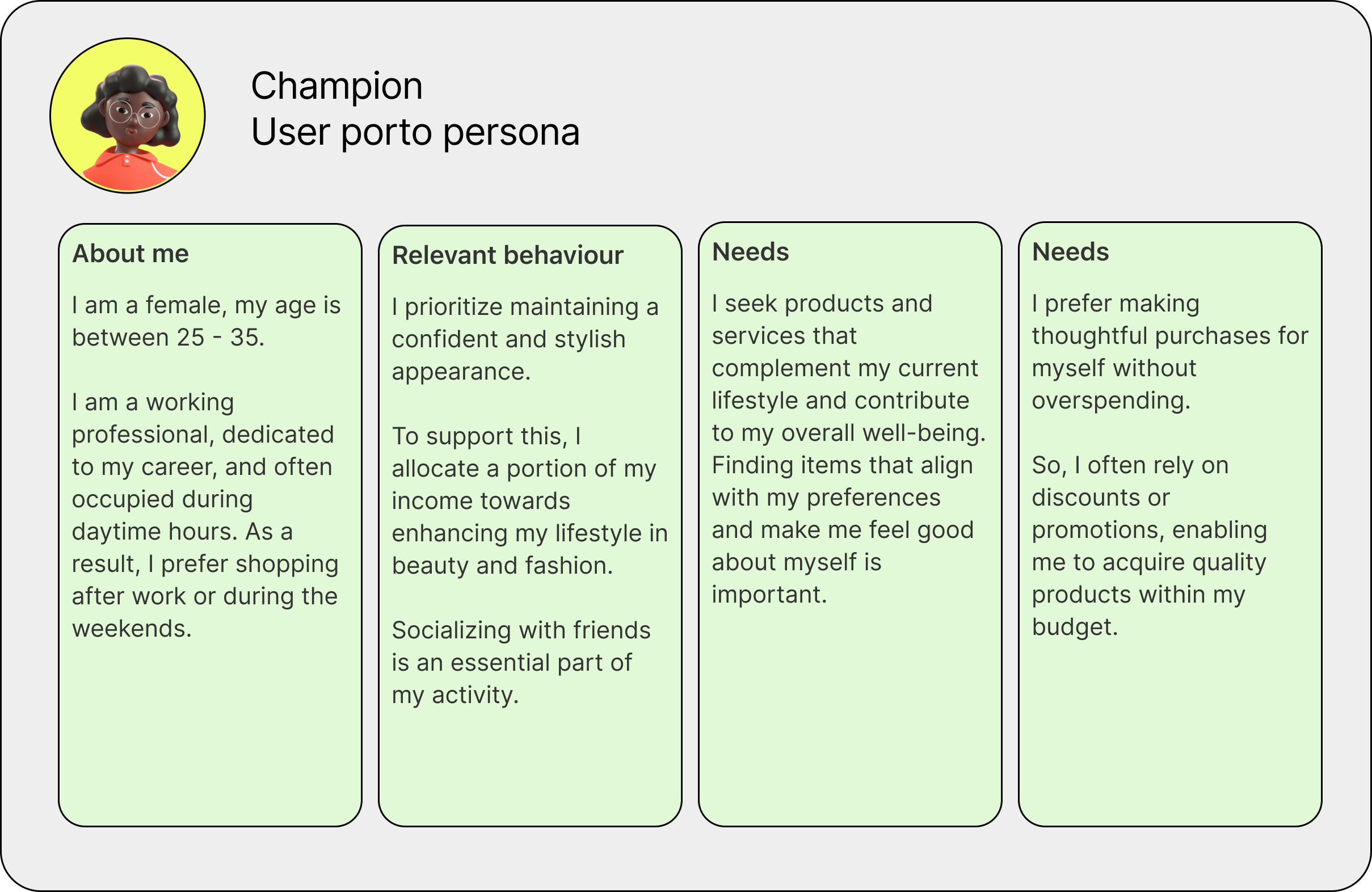
Who Are Our Users
From the research we analyzed, we built initial proto-personas, which were then tested and refined through direct user interviews.
These interviews helped us validate the personas, ensuring they accurately reflected the characteristics and needs of real users.
Note: Creating more realistic user personas is to gained a clear framework to guide our design decisions. These personas became central to our ideation sessions, helping us map out user journeys and identify where improvements would make the most meaningful impact.
Finding the Solution
Design Sprint
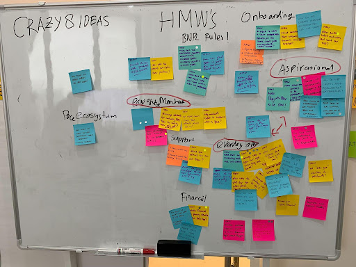
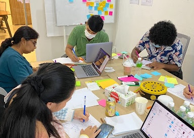
To move from insights to action, I facilitated a 2-day design sprint that brought together stakeholders from various teams. The goal was to align everyone’s understanding of the problems, generate ideas, and shape a clear direction for the product’s future.
Having multiple perspectives in the room not only helped us reach consensus faster, but also ensured that every voice was considered. By the end of the sprint, we had a shared vision of the key challenges and a variety of potential solutions to explore further.
Activities included:
- Mapping out the customer journey.
- Defining the core problems.
- Ideating on potential solutions.
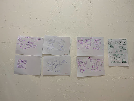
- Sketching early concepts.
- Creating wireframes to test feasibility.
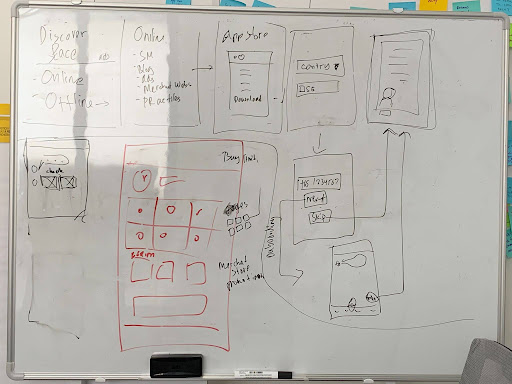
Design exploration
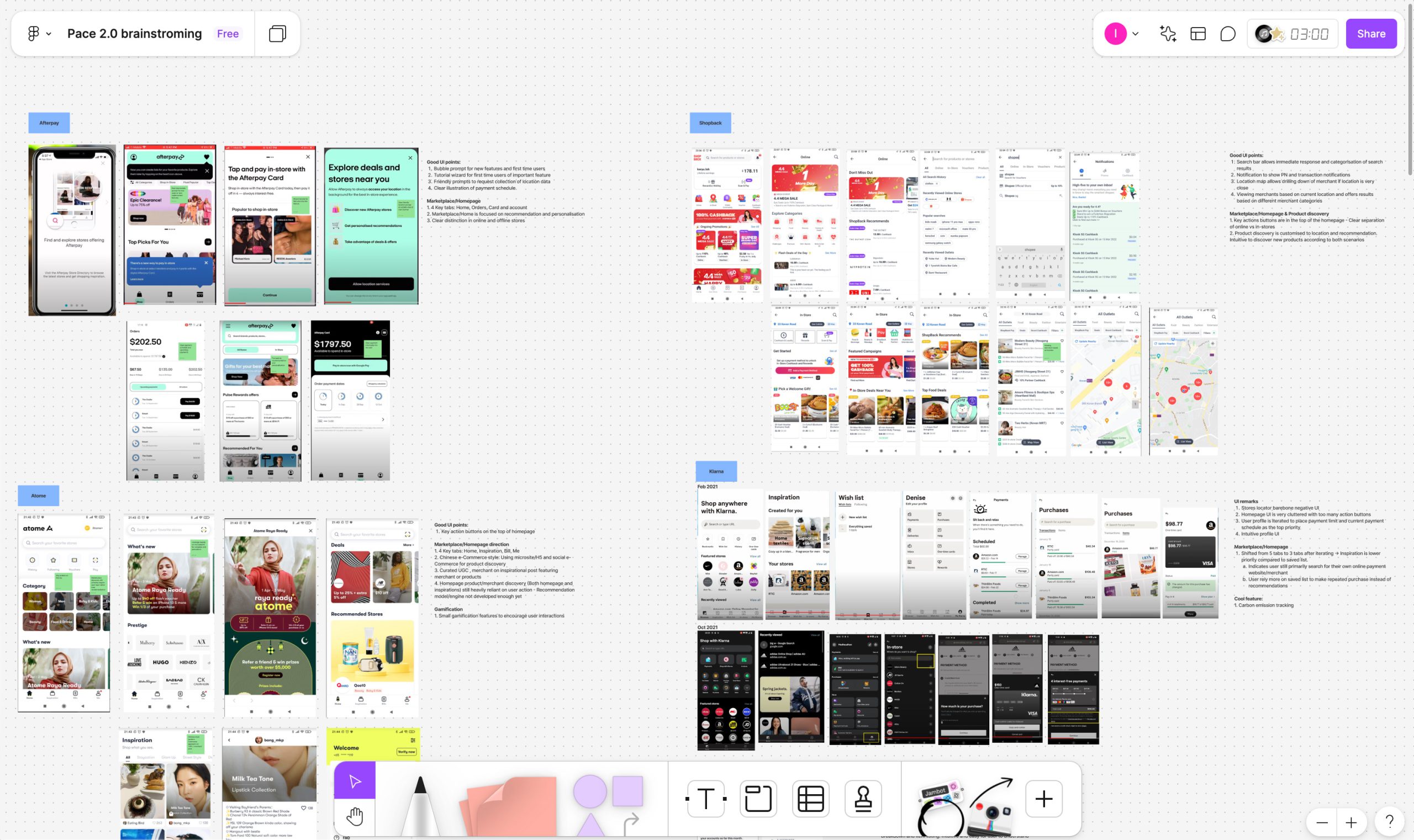
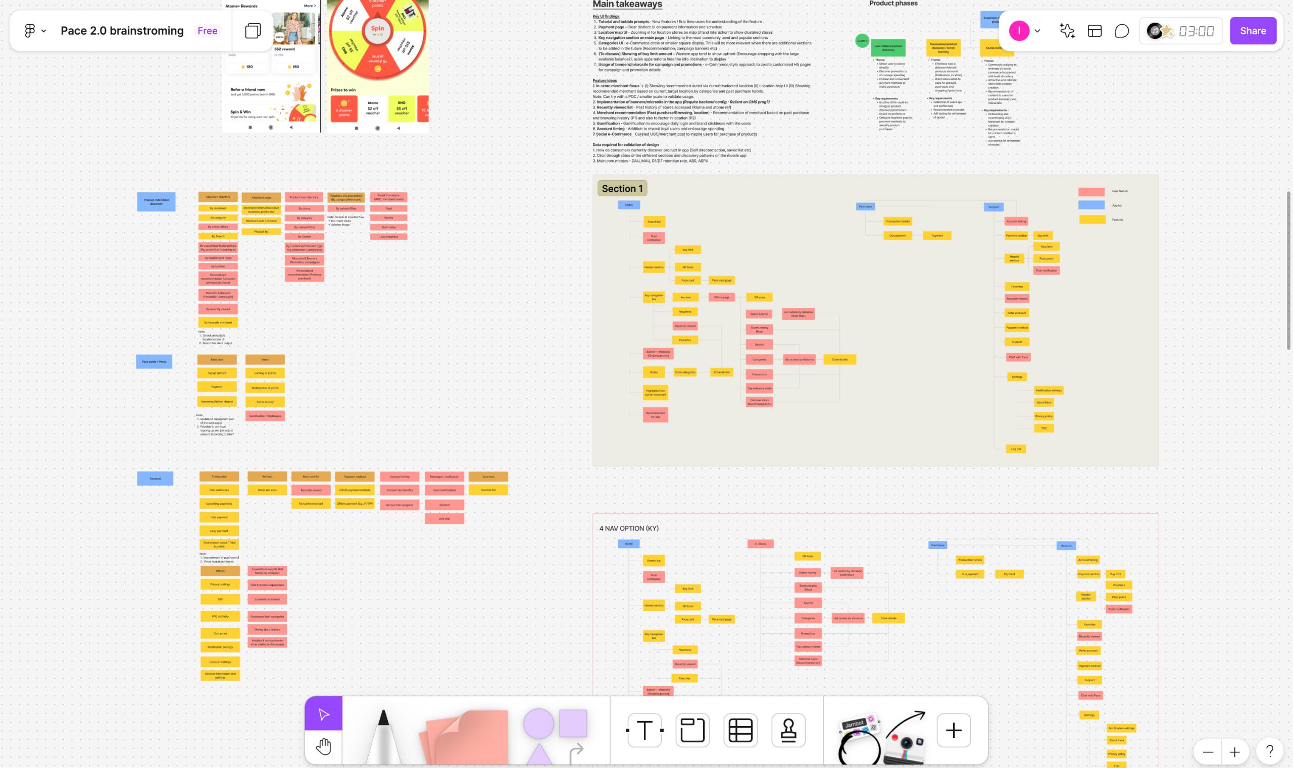
New design system
We learned from design audit that current design system was buggy, a bit all over the place, and just couldn’t keep up with the changes we wanted to make. So, we decided to start fresh and create a new design system that would support the app’s redesign.
To avoid similar issues in the future, we formulated three design principles in this new design system:
- Hyperlocal: The design components are built to adapt seamlessly across different countries, cultures, and languages, ensuring a consistent experience for users worldwide.
- Flexible: It should work across a variety of devices and platforms—whether it’s websites, mobile apps, plugins, etc. This flexibility ensures a cohesive experience no matter how or where users engage.
- Scalable: Every component is crafted with scalability in mind, allowing the system to grow and evolve alongside new features, use cases, and business needs.
Solutions
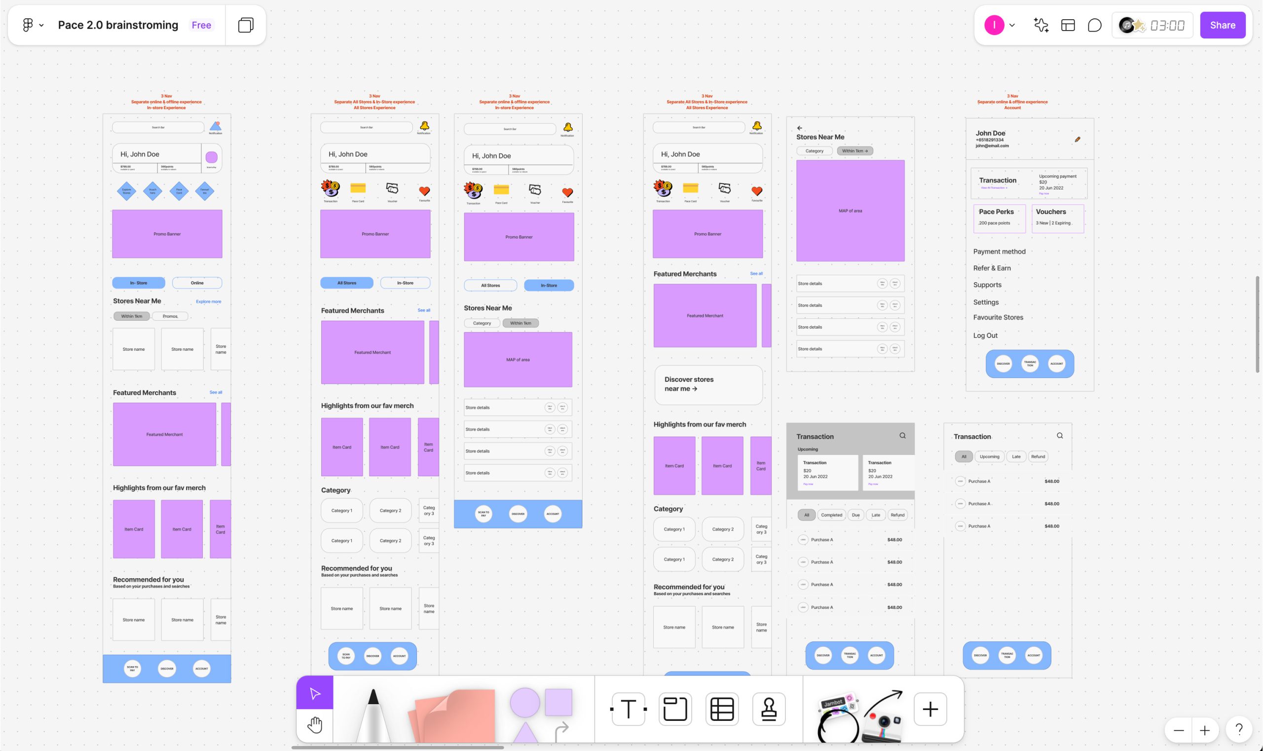
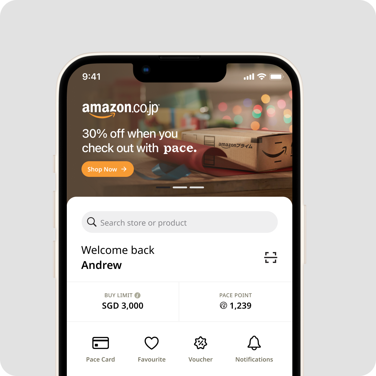
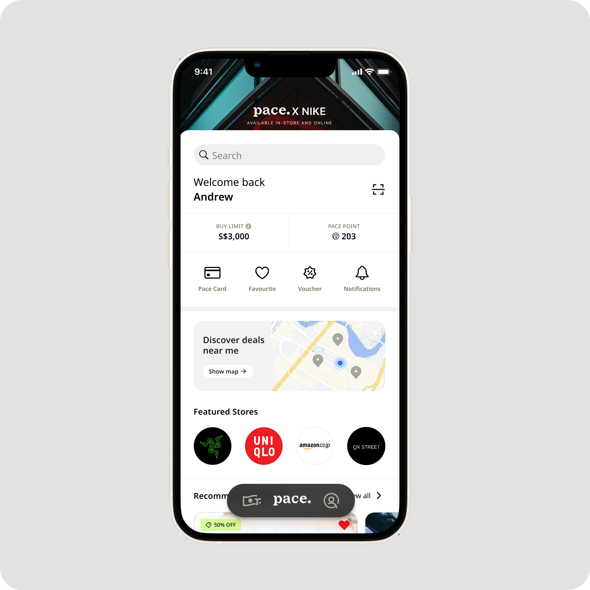
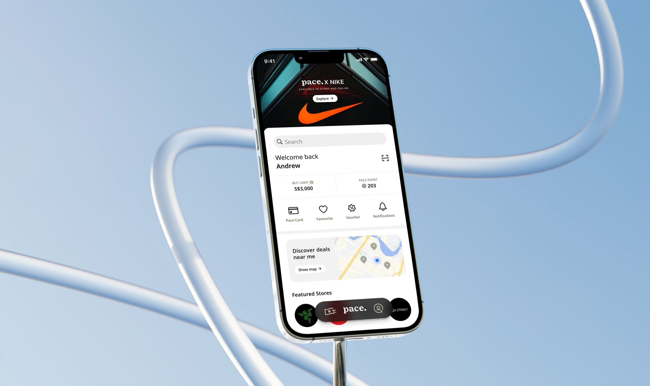
Landing page
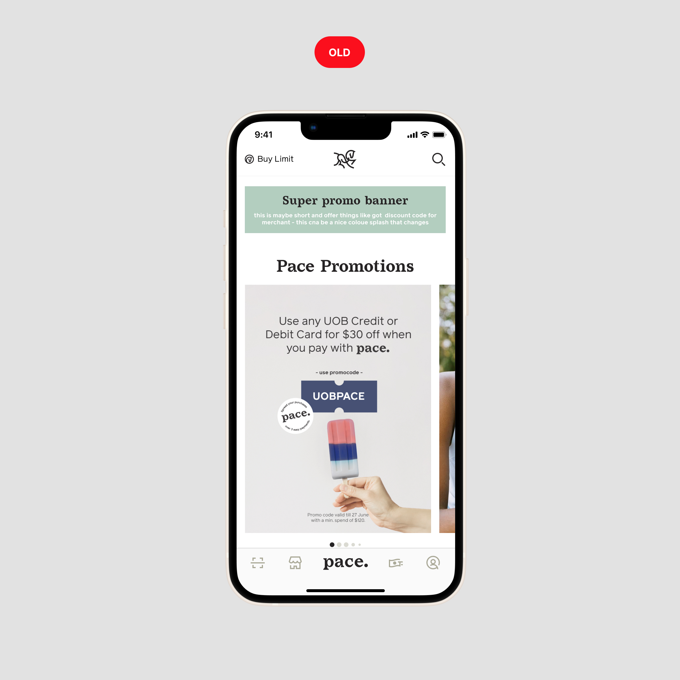
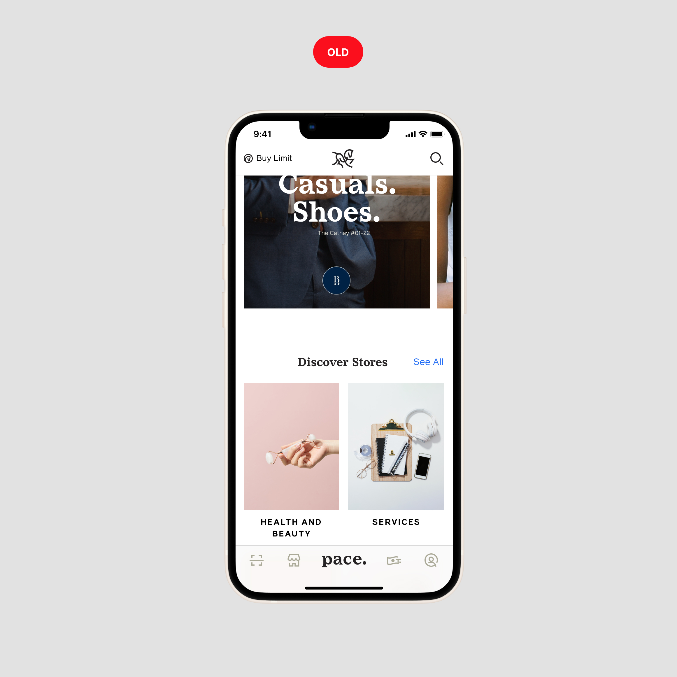
❌ Problems
- The design placed too much emphasis on promotions and vouchers, many users mistakenly perceive the Pace app as a voucher platform rather than a payment app.
- Cluttered layout and oversized banner images pushed content down, making it less accessible espeically for smaller device.
- Complicated navigation making it difficult for users to find their need.
- Important actions such as Buy Limit and Search were buried within the UI, requiring extra steps.
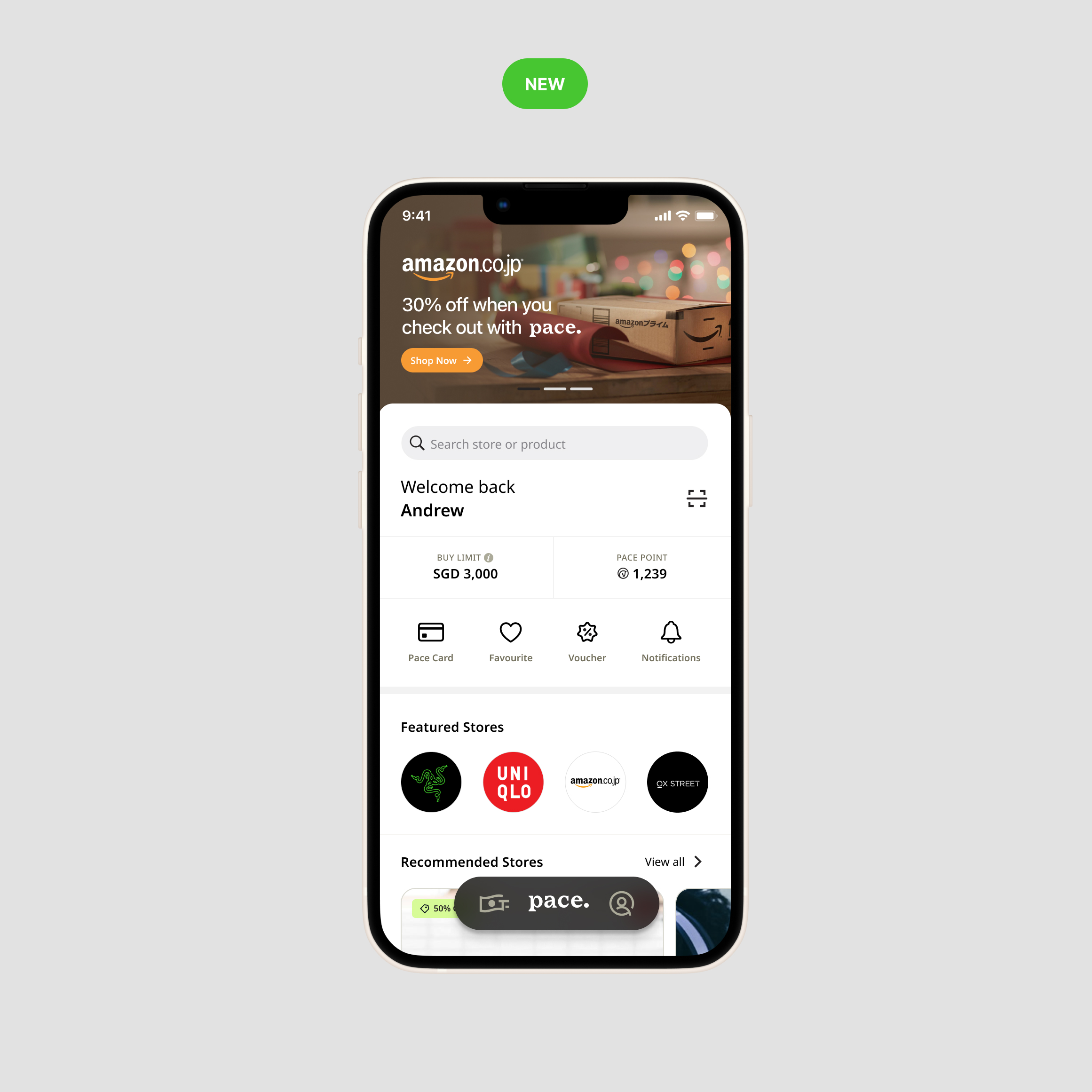
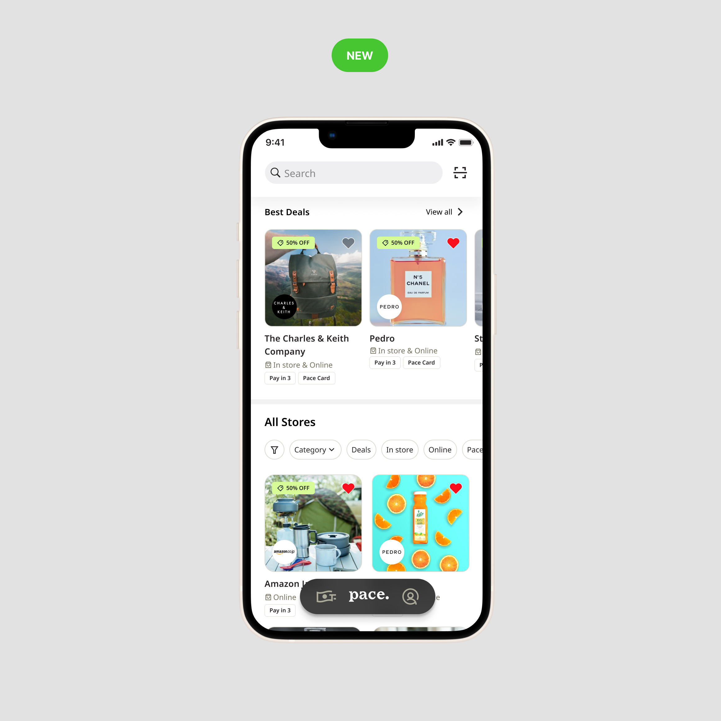
✅ Design improvement
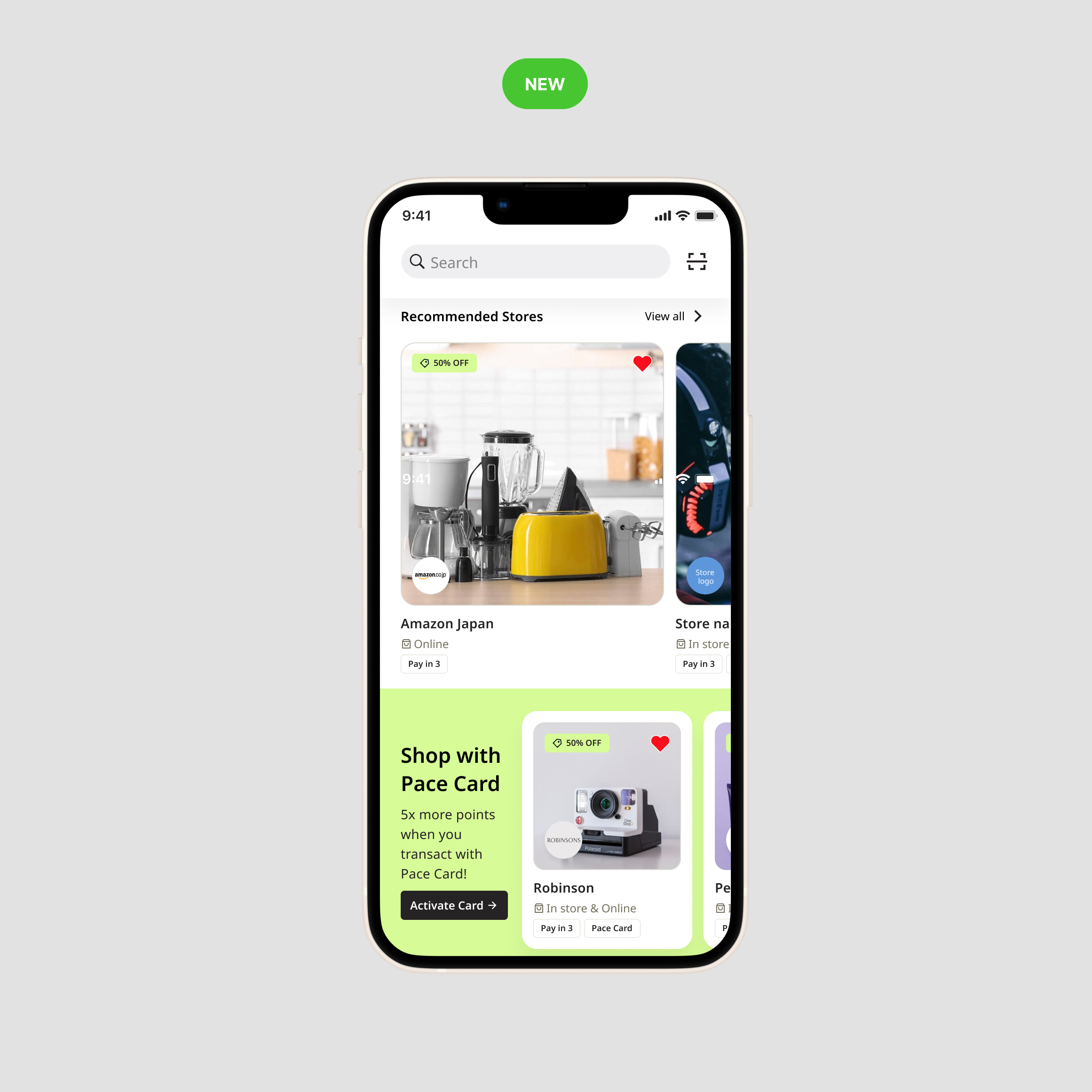
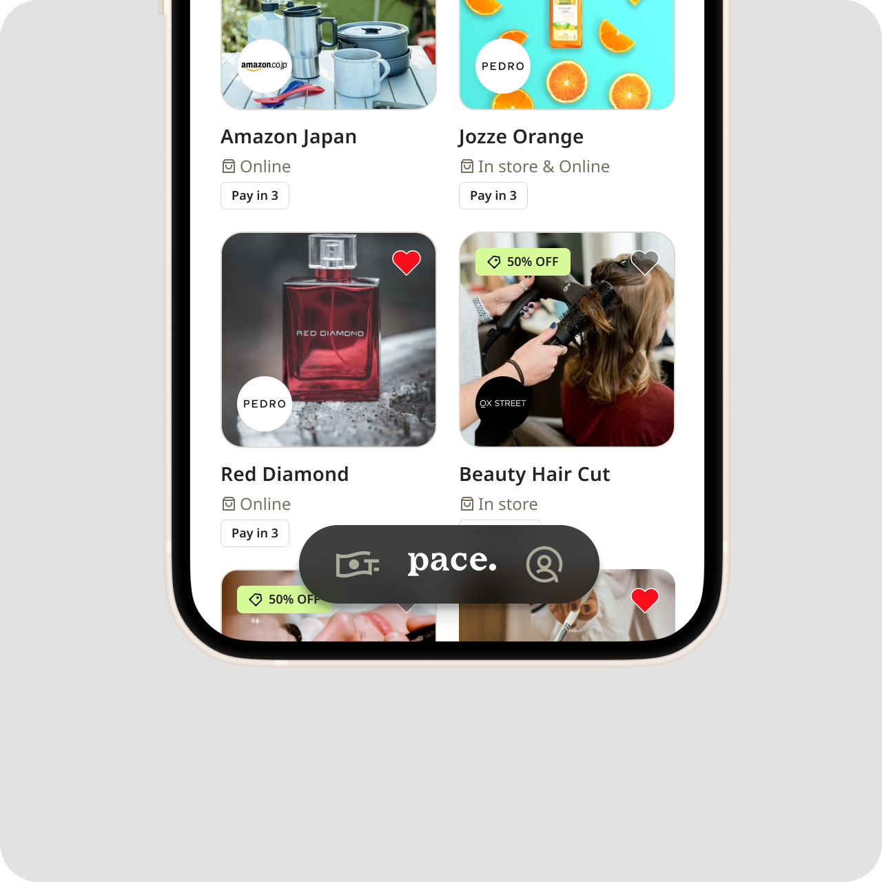
Shifted focus from vouchers to store discovery and exploration.
- Personalized the experience by welcoming users by name and displaying their buy limit, points, and other relevant user informations.
Added store tags (e.g., Deals, In-store, Online, Pay in 3) for faster browsing.
We introduced a categorized, card-based layout to enhance store discovery and engagement.
Introduced a floating “Pace” bottom navigation to maximize content space.
We simplified navigation to make the app more user-friendly.
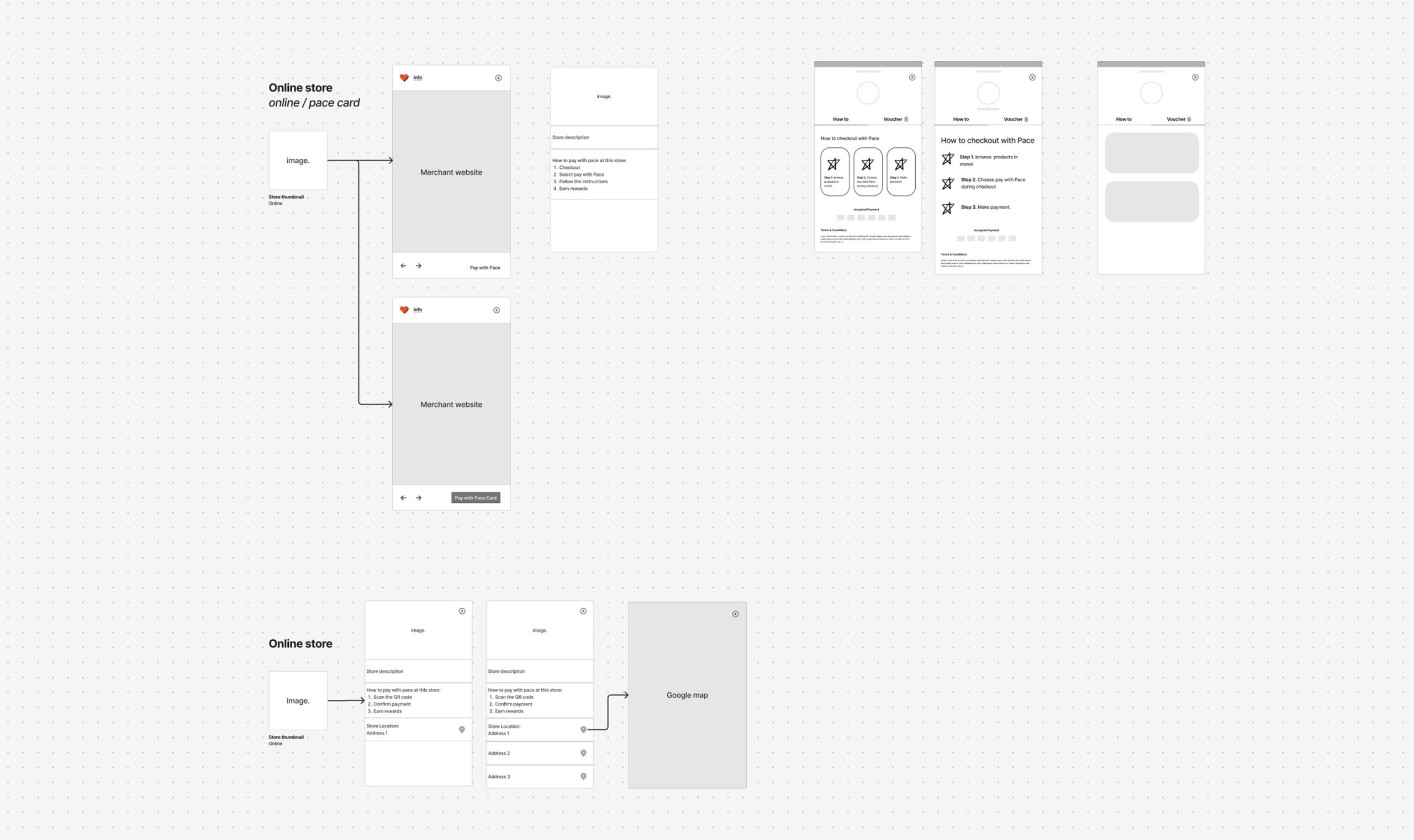
Store Page
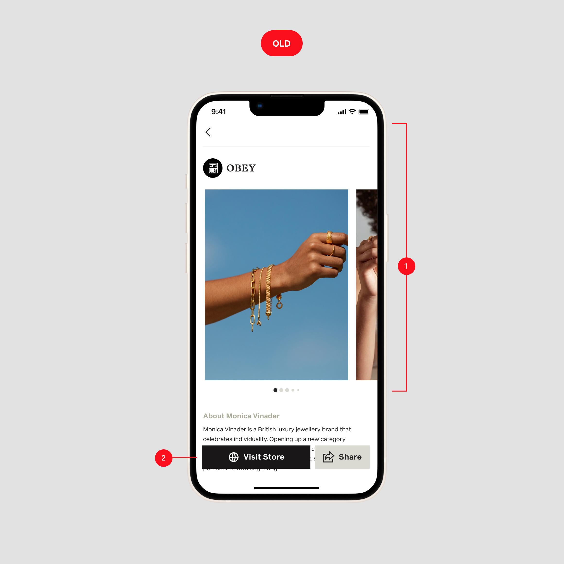
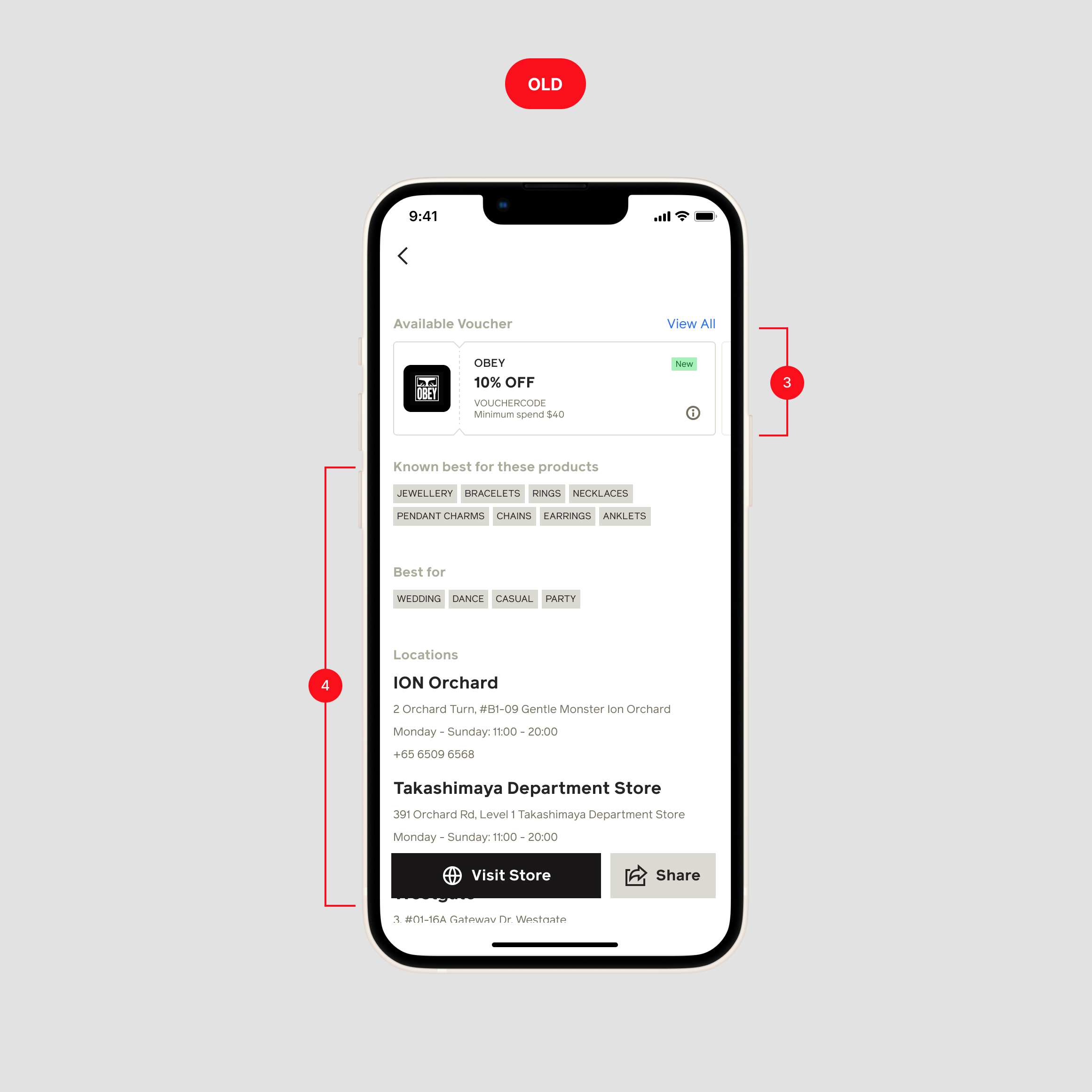
❌ Problems
- The previous design had fragmented elements and buried store information under multiple sections.
- Confusing CTA that is also not consistent, sometimes it takes to store website sometimes to maps.
- The voucher sections using sliders that's harder for user to view available vouchers.
- Store location details cluttered with unnecessary information.
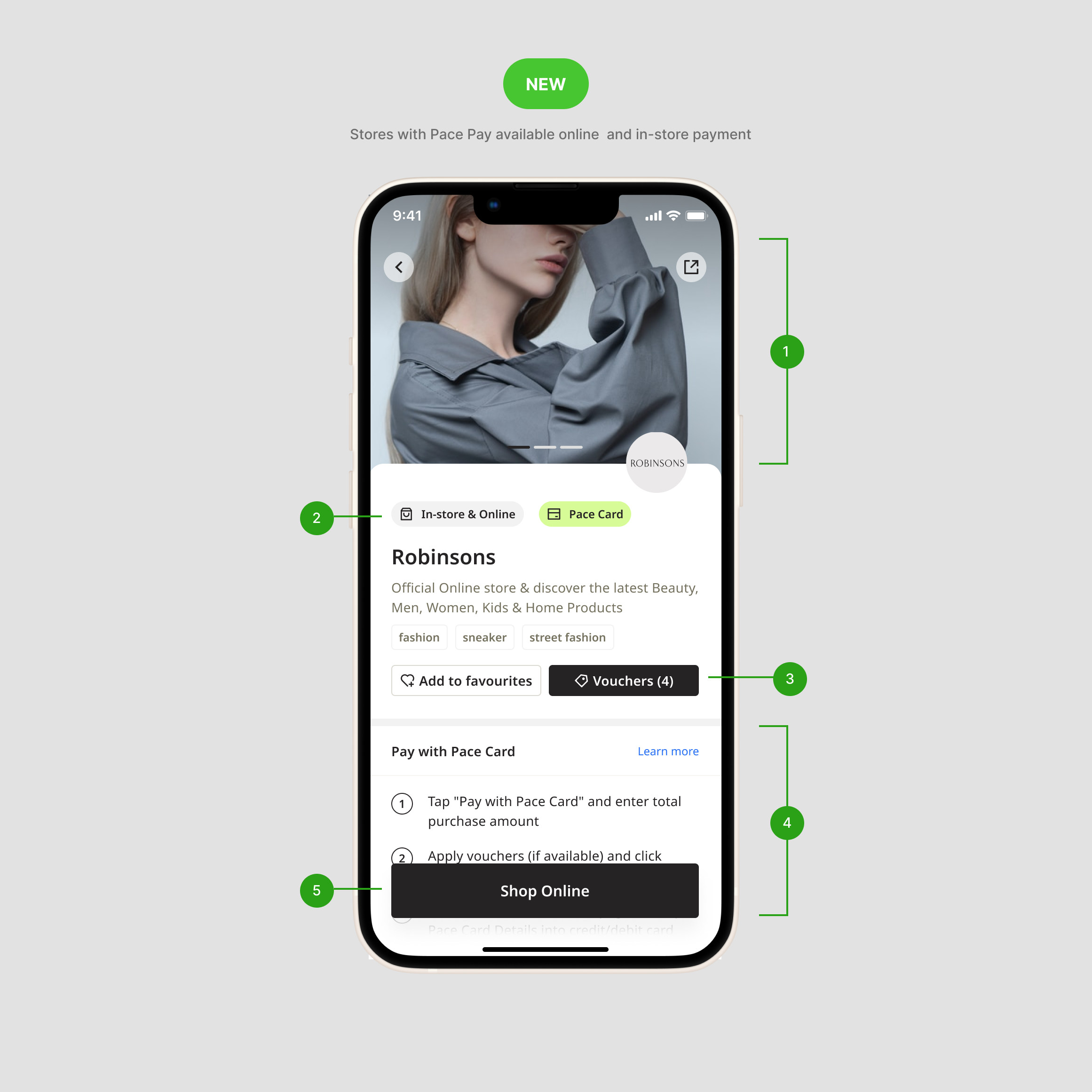
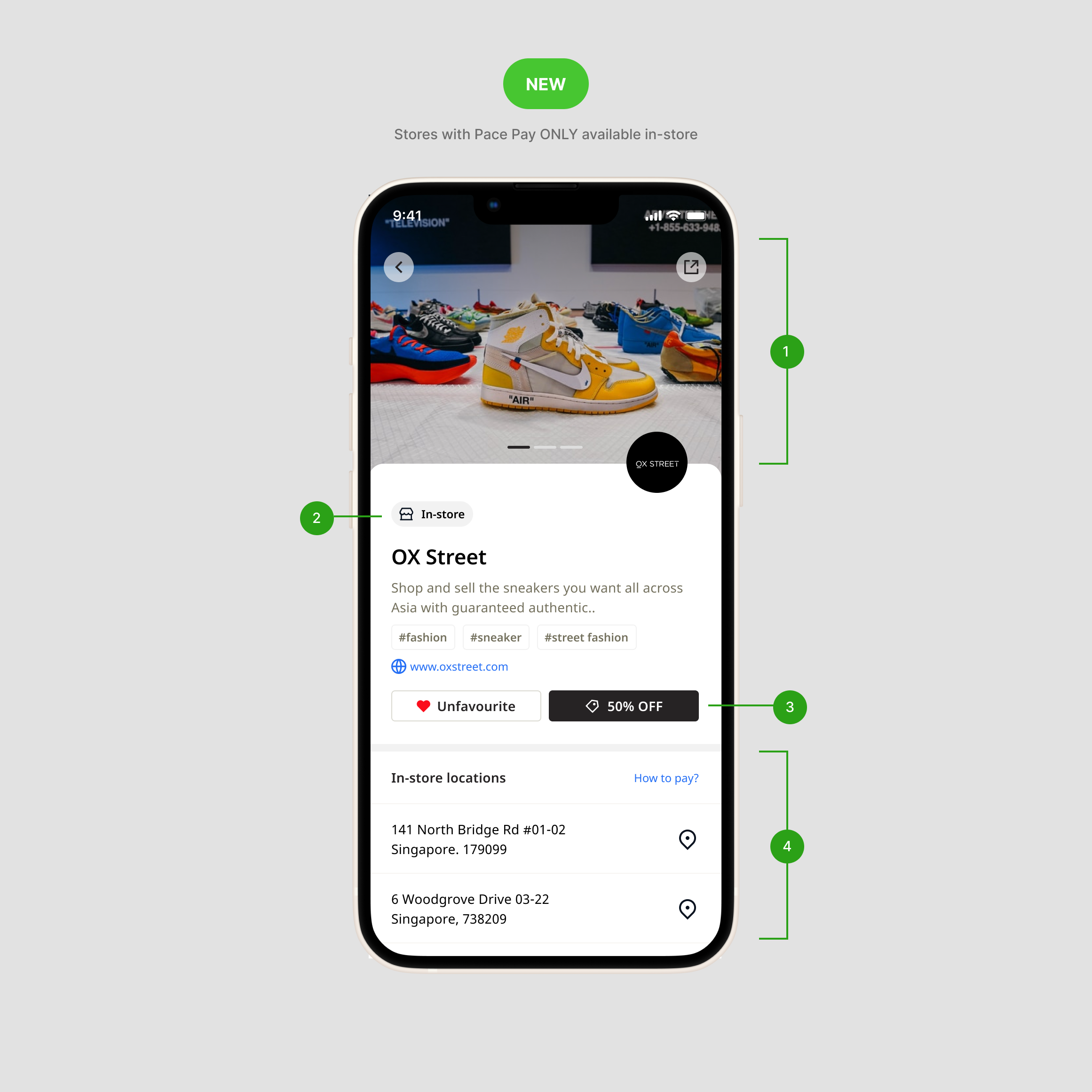
✅ Design improvement
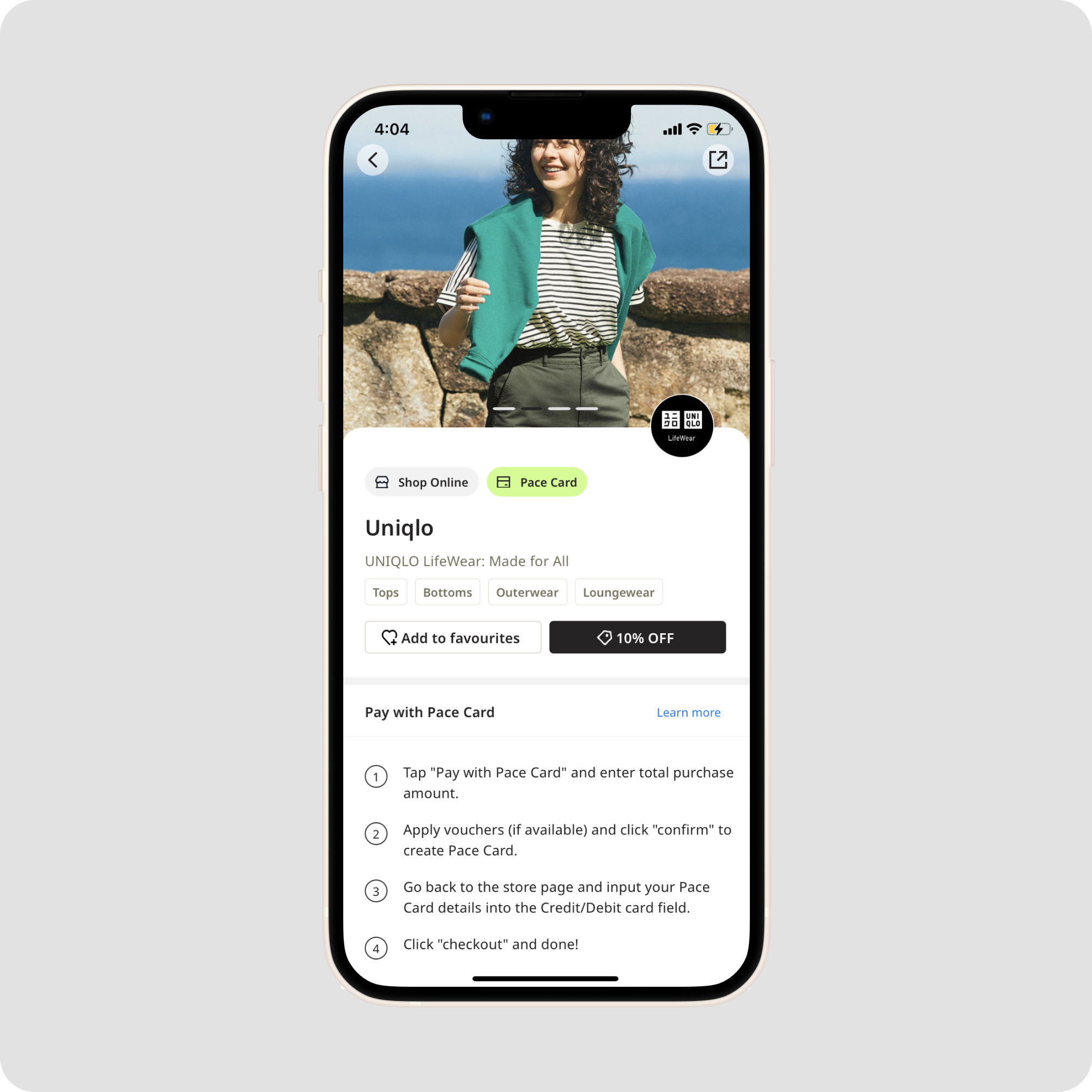
- Optimizing of spacing, improving typography, and redesigned the layout to create a clearer visual hierarchy.
- A new label system (e.g., In-store or In-store & Online) help users for the purchasing options.
- Users can now access discounts easily in separate page, making it easier to find available voucher.
- In the new design, informations are clearly structured, with content is different between store type (payment in store, payment in online and instore, paymen online only).
- The CTA buttons are now more visually distinct and straightforward, making it easier for users to quickly access and shop at stores with online options.
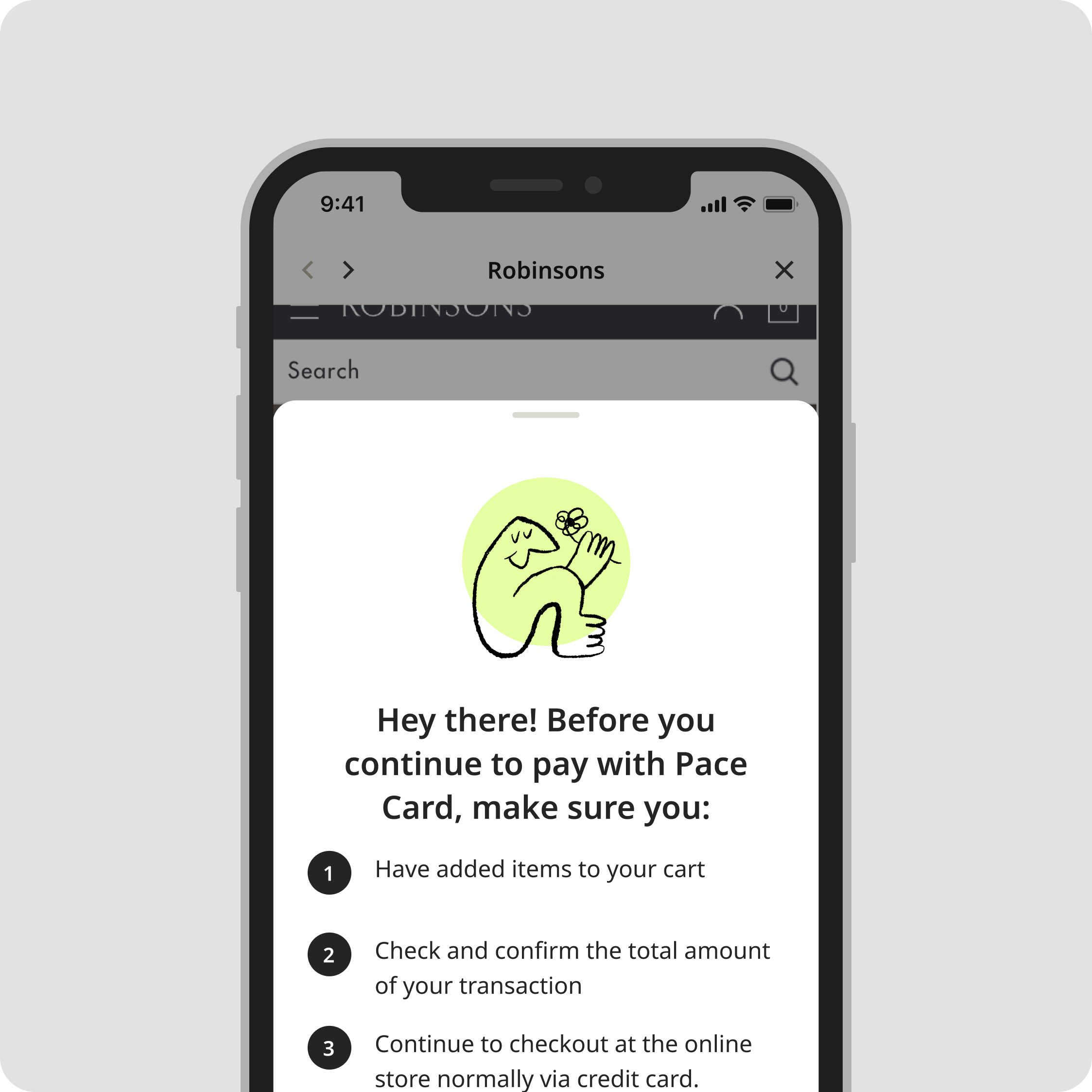
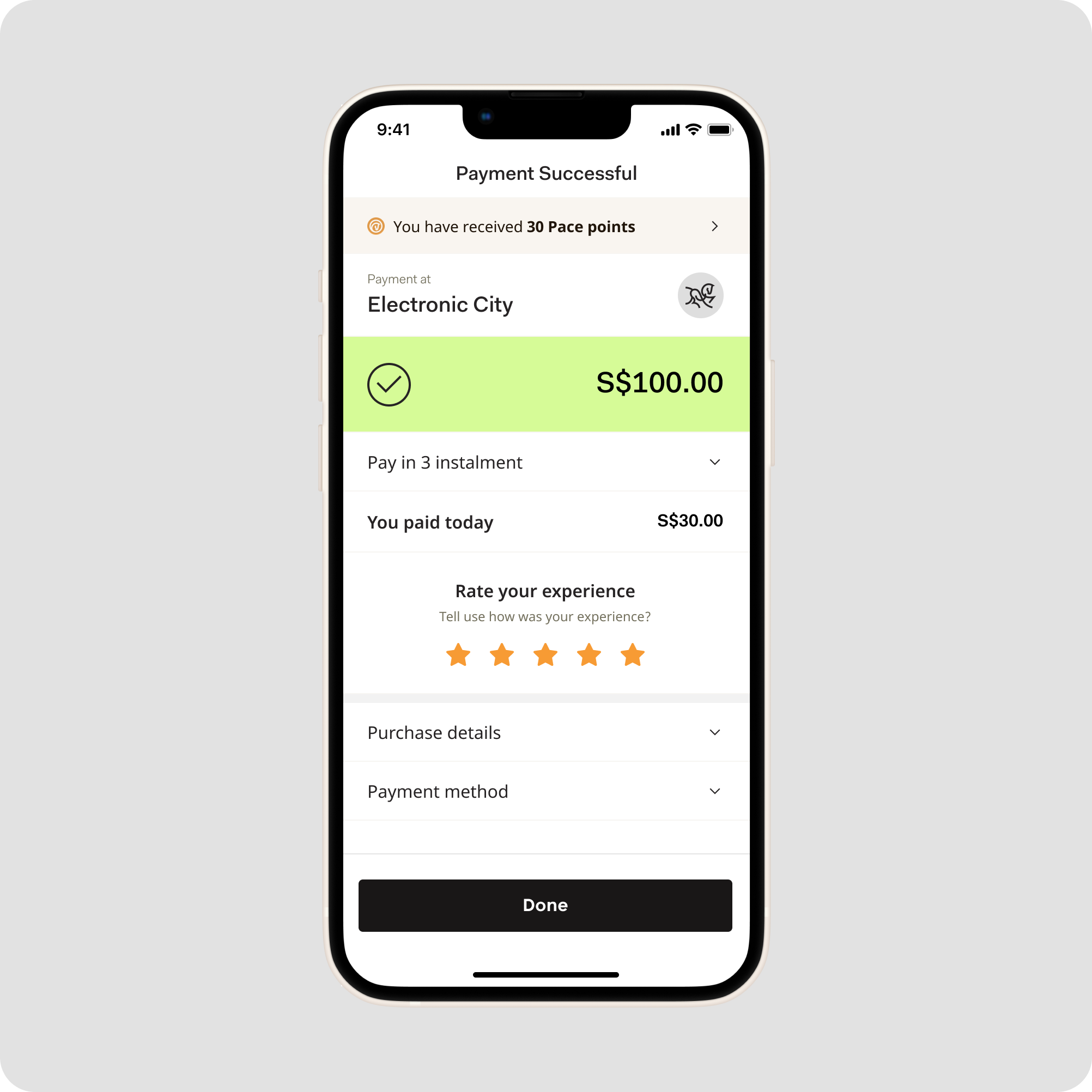
Check out (in-store payment)
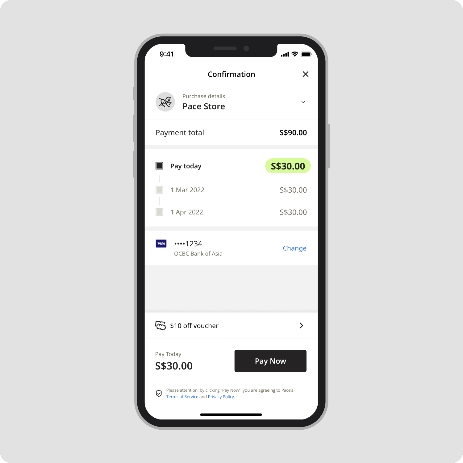
In-store payment is a key BNPL product, where users can split their payments at checkout by simply scanning a QR code. We’ve redesigned the entire flow to make the process clearer and improving transaction experience.
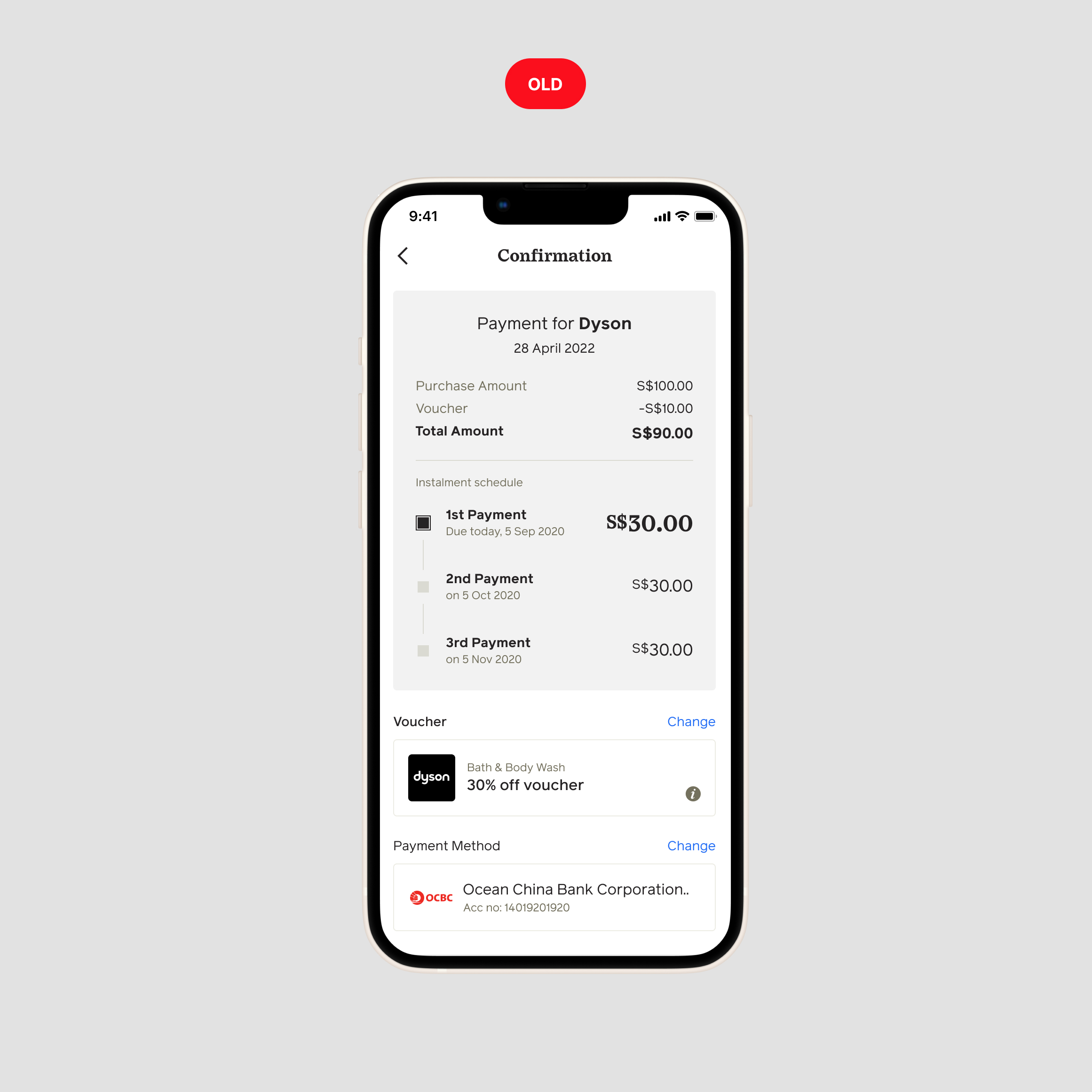
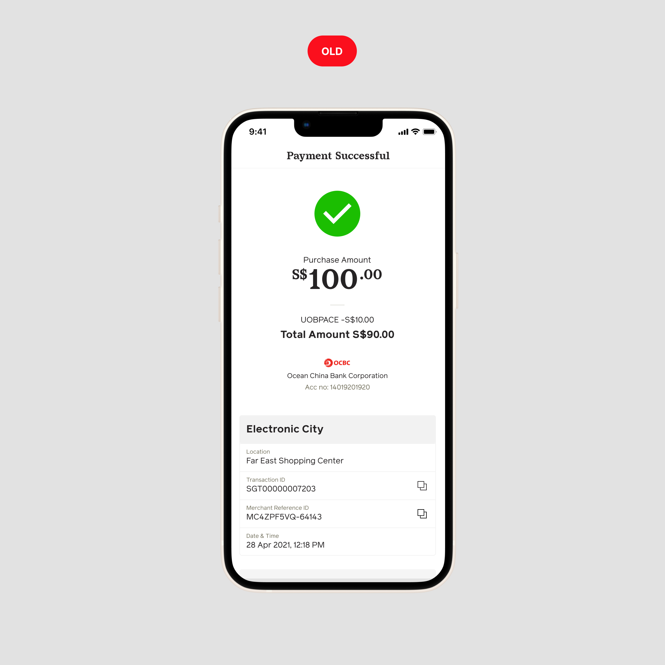
❌ Problems
- Payment details were spread out, making it difficult for users to quickly review their purchases, especially in crowded store.
- Payment method information was placed lower in the interface hierarchy, making it less visible.
- The voucher UI took up excessive space with unnecessary design elements, creating visual clutter and making it harder to read.
- The “Pay” button was positioned too far down, leading some users to miss it and assume they had already completed their payment.
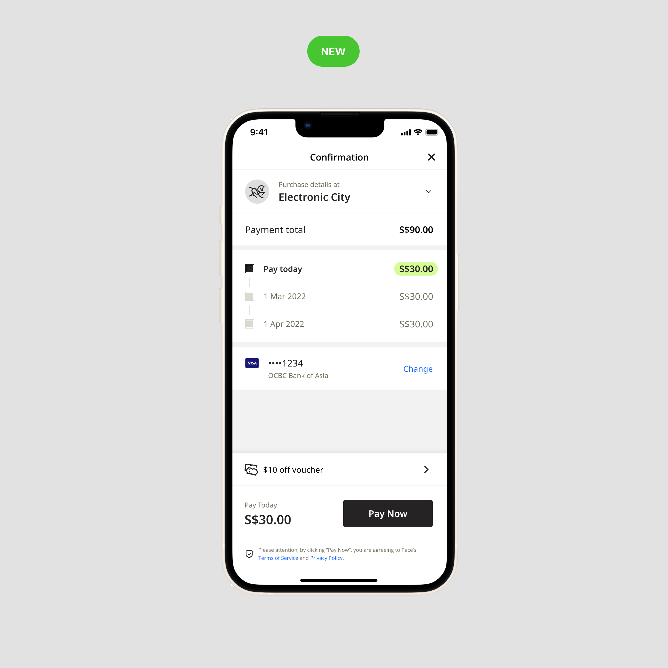
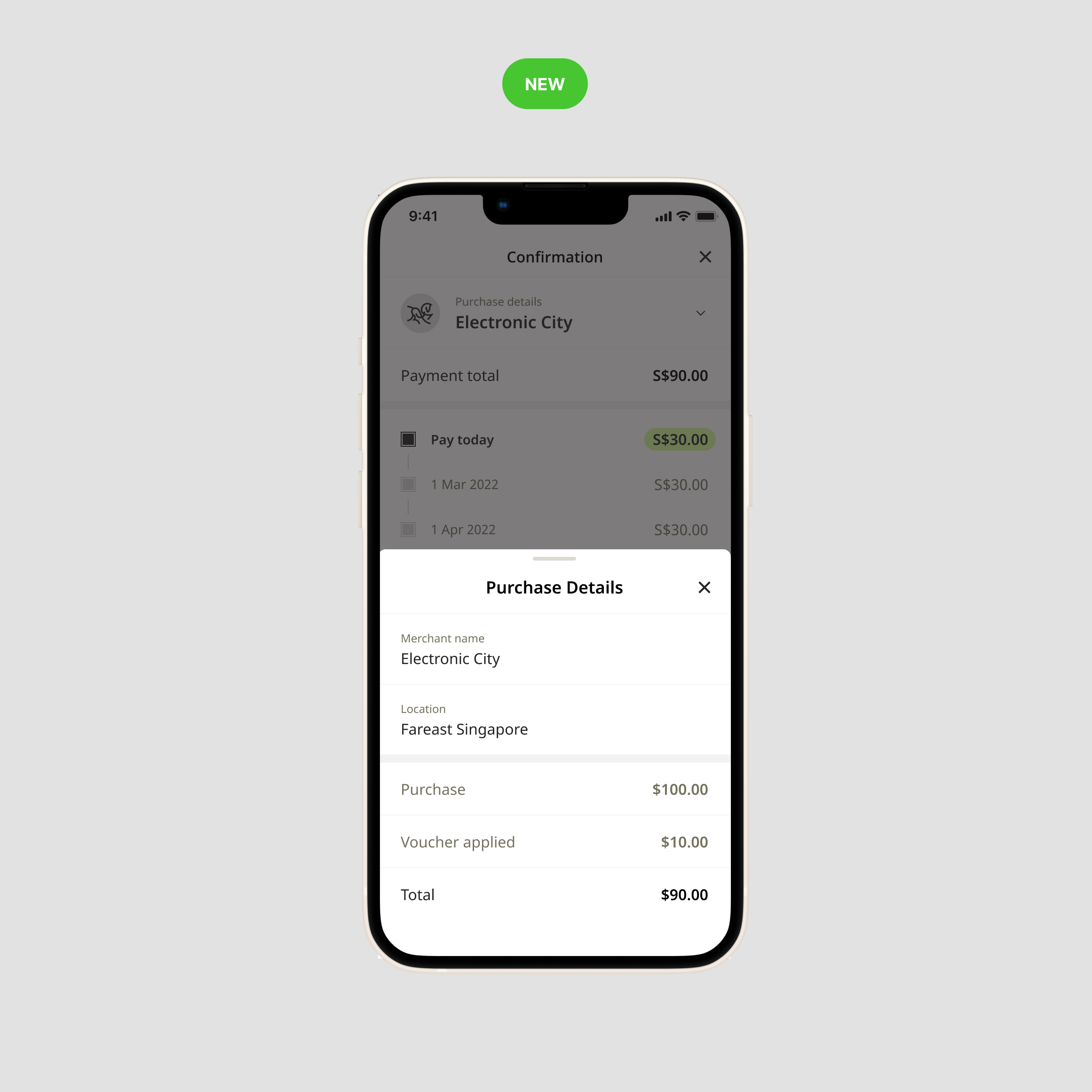
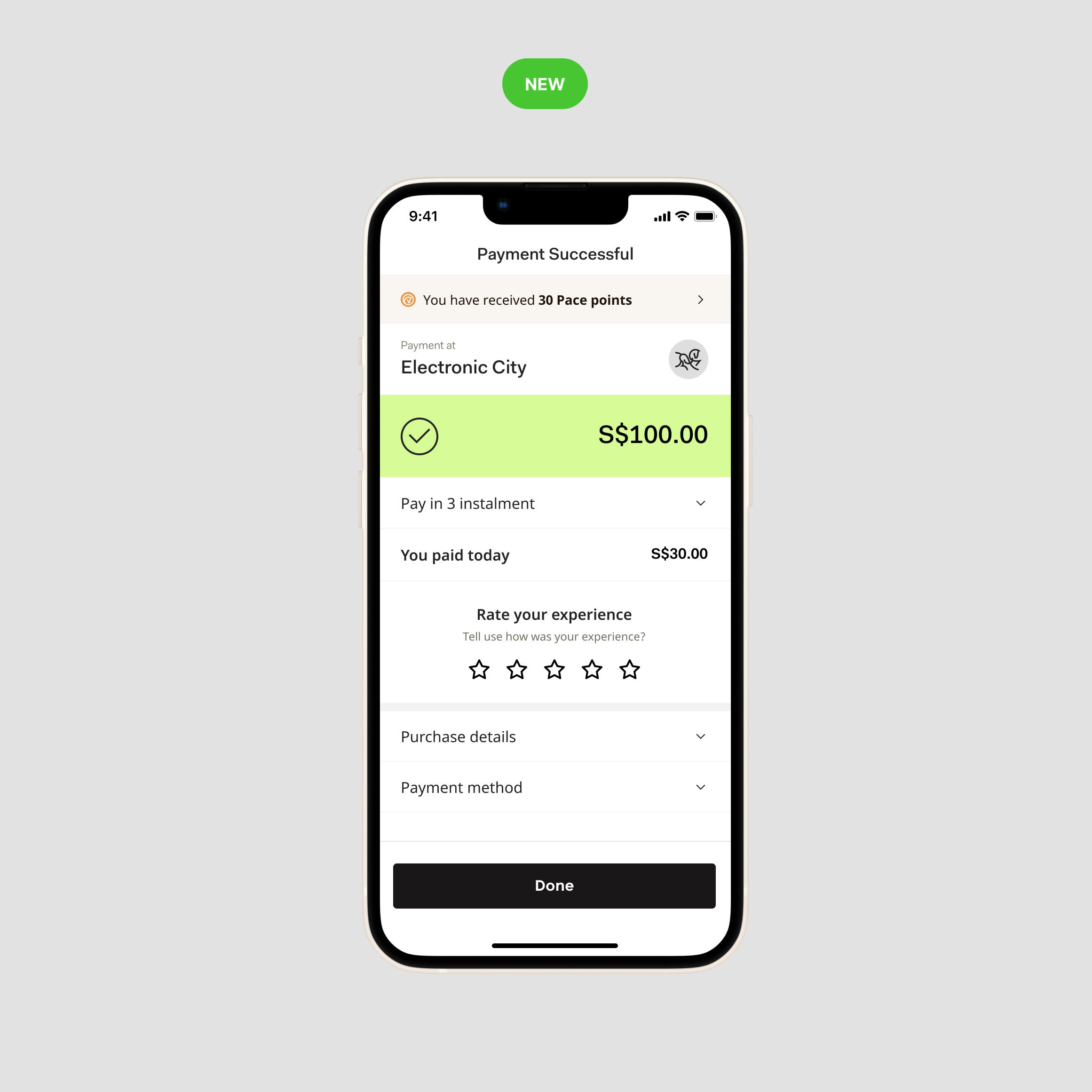
✅ Design improvement
- Improved iconography and white space for a cleaner view make it easier to read at glance.
- A clearer breakdown of the payment total and installment schedule in a structured layout.
- A more prominent “Pay Now” button includes the exact amount due today, providing users with clarity and confidence in the payment process.
- Introduced a rating system to gather user feedback and improve the payment experience.
- The selected payment method is clearly displayed.
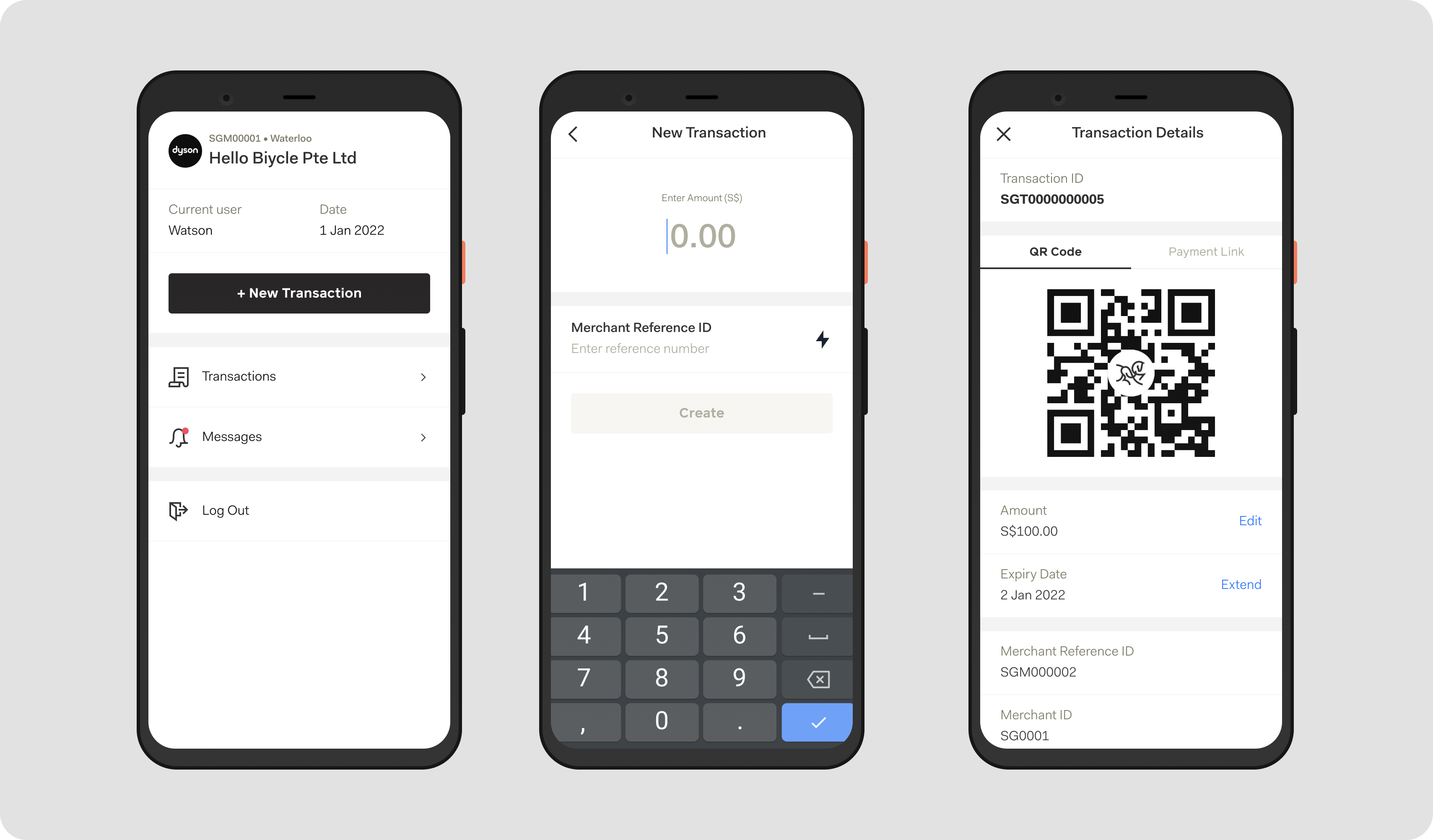
Gamification, Rewards and Pace Card
We also introduce some gamified elements such as rewards and Pace Perks to incentivize users to interact more frequently and make transactions using Pace App.
Final Design
Summary
Lesson Learned
This redesign project goes beyond UX and UI changes—it reimagines how users interact with Pace Pay. Our ultimate goal is to establish BNPL as a compelling alternative to traditional credit and debit cards. However, this effort wouldn’t be successful without the support and buy-in from other teams and management.
Impact
Online shopping from the Pace app increased by nearly 20% following the new design launch.
Successful onboarding of new users improved by 10%.
- User session duration within the app increased by 40% mostly spend in the landing page (store exploration)
Other Works
Redesigning "Buy Now Pay Later" App ExperiencePace Enterprise Singapore • 10 min read
Designing AI Models BuilderZinier Singapore • 5 min read

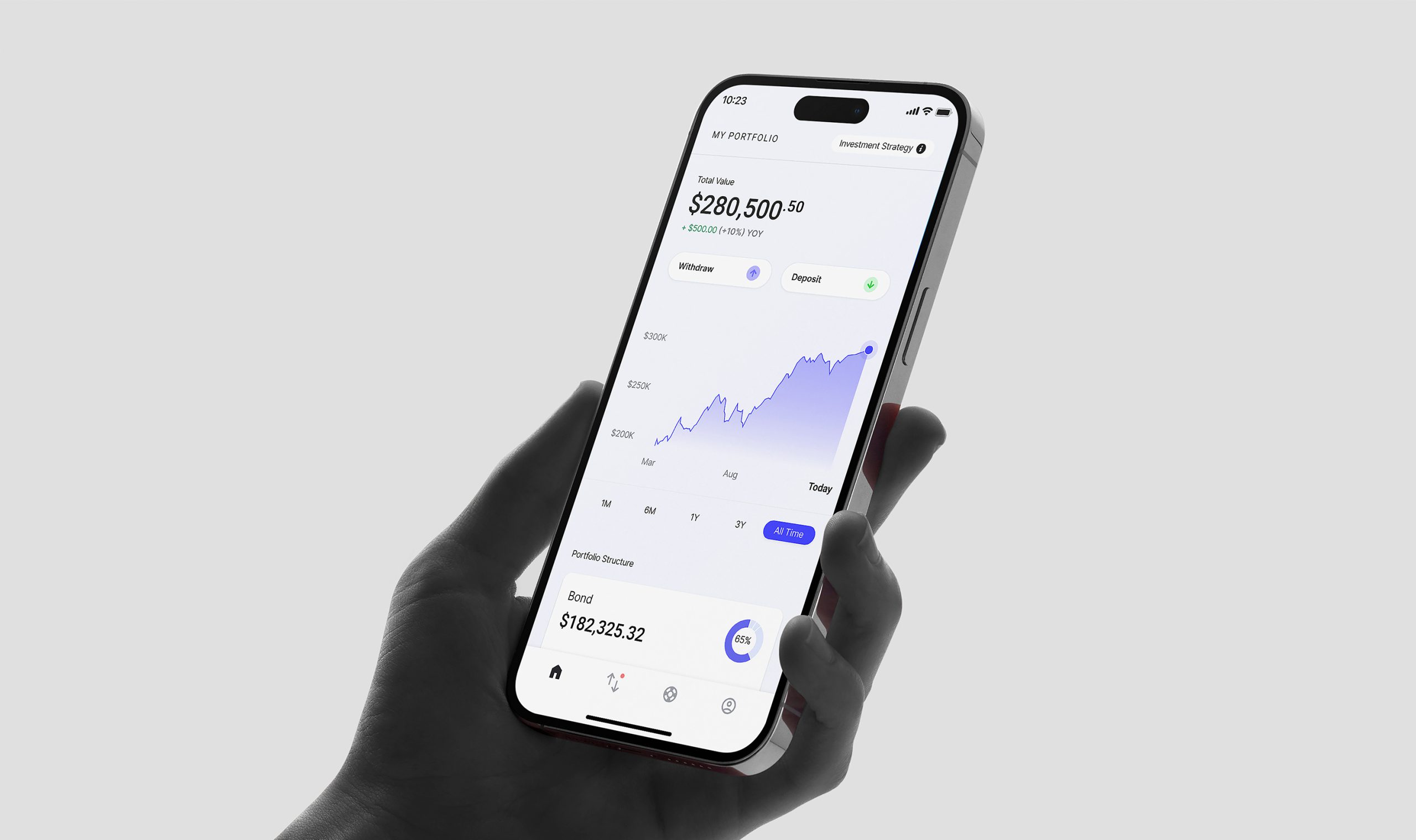
Simplifying Wealth: Redesigning Additiv’s Client PortalAdditiv • 5 min read
How to Design a Digital Marketing SimulatorNovela Ltd UK • 5 min read

Designing a Real-Time, Intelligent Dispatch ExperienceZinier Singapore • 5 min read
Designing Wealth Management Service for South East AsiaAdditiv Singapore • 3 min read

Designing the first Singapore's First Digital Wealth Advisory ServiceCrossbridge Capital • 3 min read

Designing Employee Engagement ExperienceStandard Chatered • 2 min read