ROLE
Lead UX/UI Designer
responsibility
Research, UX & UI, testing, and project management
PROJECT TYPE
Digital Product Design
ownership
additiv.com
more info
About Additiv
Additiv is a leading Swiss fintech, offers a unified platform for wealth, banking, credit, and insurance services.
Introduction
As demand for digital wealth solutions grows across emerging markets, Additiv saw an opportunity to rethink its client portal. While the existing platform was feature-rich, it proved too complex for most users. This project set out to redesign the portal—making it more intuitive and user-friendly.
Project Background
Additiv already had an existing client portal in place. However, we keep hearing that market feedback revealed that the portal was too complex and too advanced for most users, especially those unfamiliar with sophisticated financial tools.
In response, leadership challenge the product team with redesigning the portal to be significantly more user-friendly, while still supporting the broad range of business use cases across banking, lending, and insurance.
Existing Client Portal
Internal Review
We began by reviewing feedback from clients that's coming to internal team, we identifying common friction points such as unclear navigation, too much financial jargon, and is not made to cover different verticals outside investment such as loan, banking or insurance.
To validate our assumptions, we conducted internal stakeholder interviews and competitor analysis. We mapped user journeys for typical end users to better understand where the experience broke down.
Design Goal
Designed a client portal that balances user needs with business flexibility.
Understanding
🎯 Target audience
In summary there is two key audiences:
• End users, Need a simpler way to manage or view their finance.
• Business clients, Need flexibility on the implementation.
👦🏼 Touchpoint lead behaviour
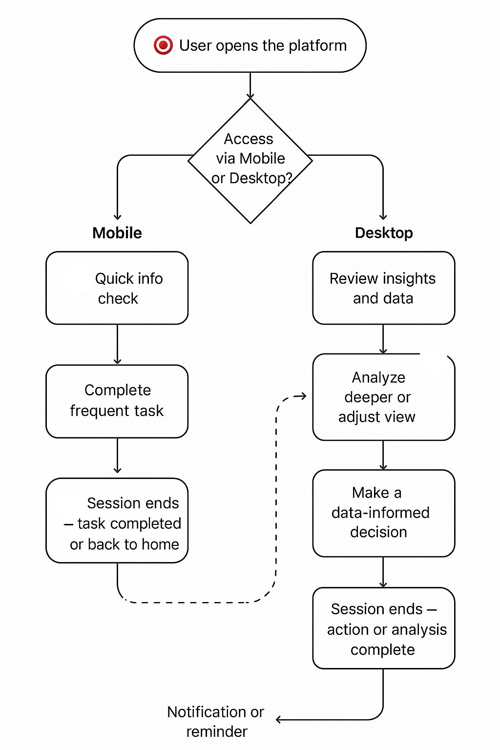
Our research revealed that the same user can have different needs and behaviors depending on the device they use:
- On mobile, users tend to seek quick access, they want a fast, streamlined view of key information on the go.
- On desktop, the same users expect deeper insights, they’re more focused on analysis, customization, and managing complex tasks.
This insight helped me tailor the experience across platforms, make sure each touchpoint supports the user’s intent and context of use.
💼 Business Needs
Internally, Additiv needed this platform to serve as a showcase of its capabilities, demonstrating how the solution can adapt to various business use cases across different financial services.
🌋 Design Challenge
To meet Additiv’s internal goal of using the platform as a showcase of its capabilities across multiple business use cases, the design needed to strike a delicate balance between flexibility, scalability, and usability.
One of the key challenges was ensuring the platform could support a wide range of financial services (such as wealth management, lending, and insurance) without creating a fragmented or overly complex user experience.
Each vertical comes with its own data structures, workflows, and user expectations, making it crucial to build a system that was both modular and adaptable.
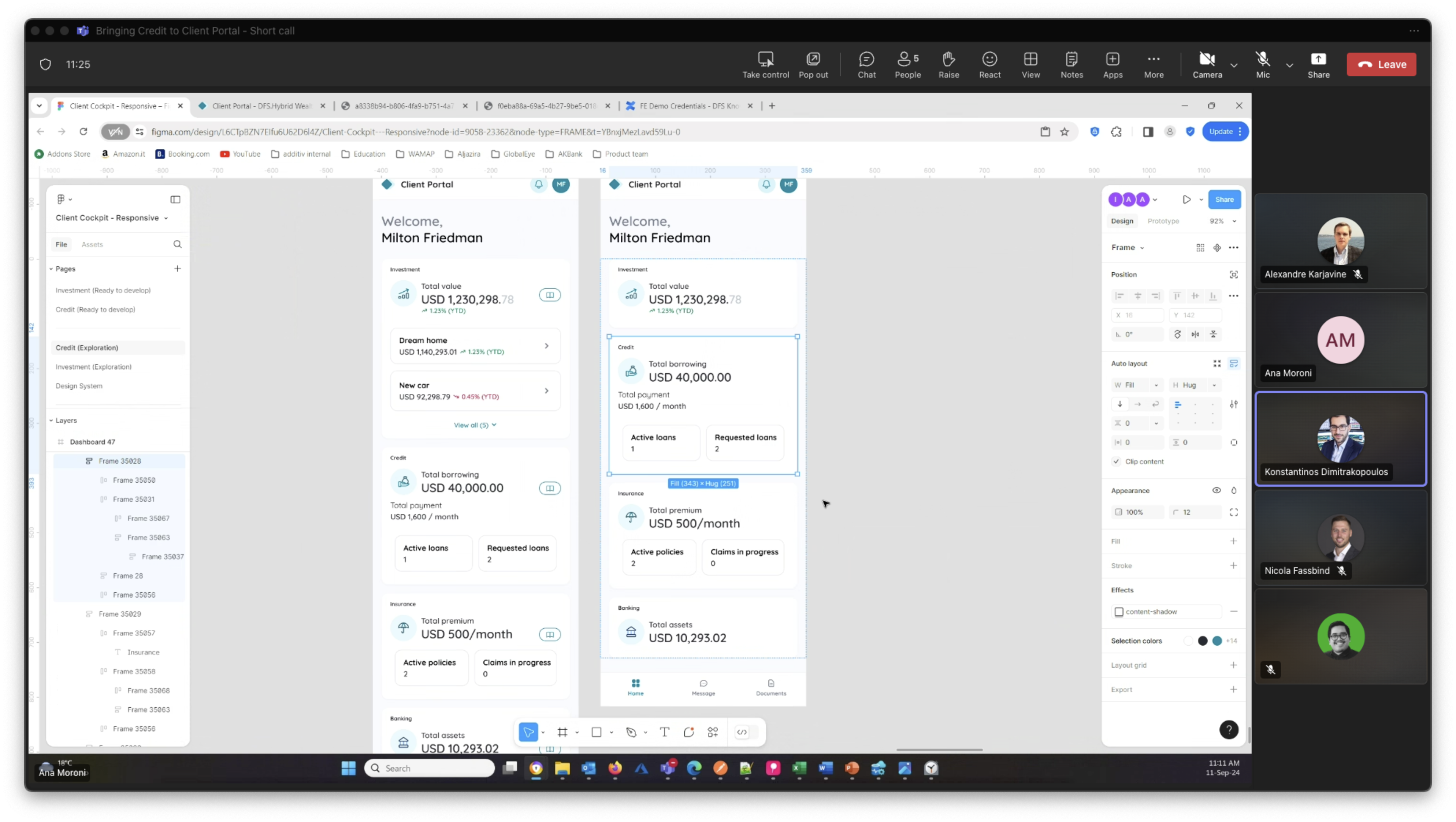
🔁 Design & Iterate
I validated the prototypes with internal teams, testing not only the user experience but also the business value of each feature to ensure it aligns with real market needs.
I also documented functional and technical constraints early on, working closely with the development team to inform design decisions and avoid downstream issues.

Result
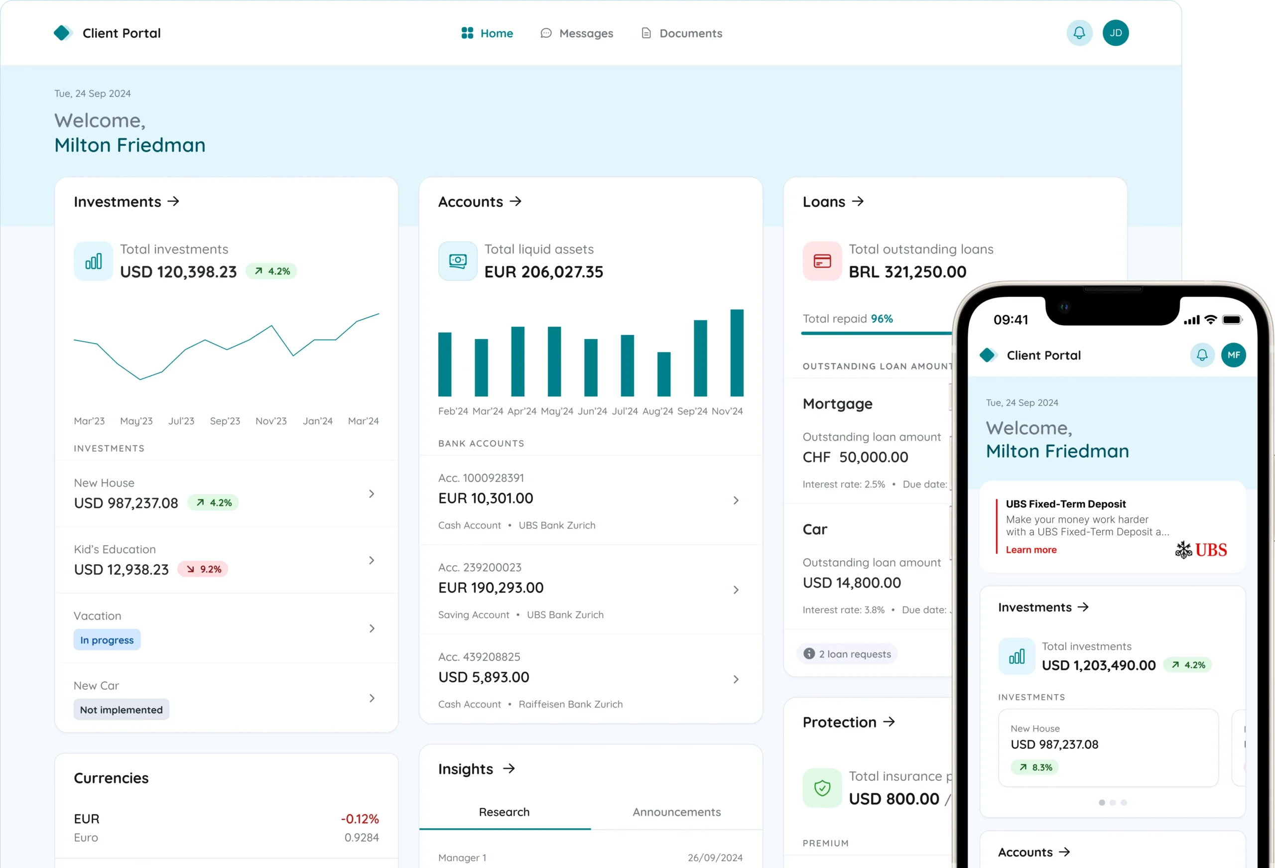
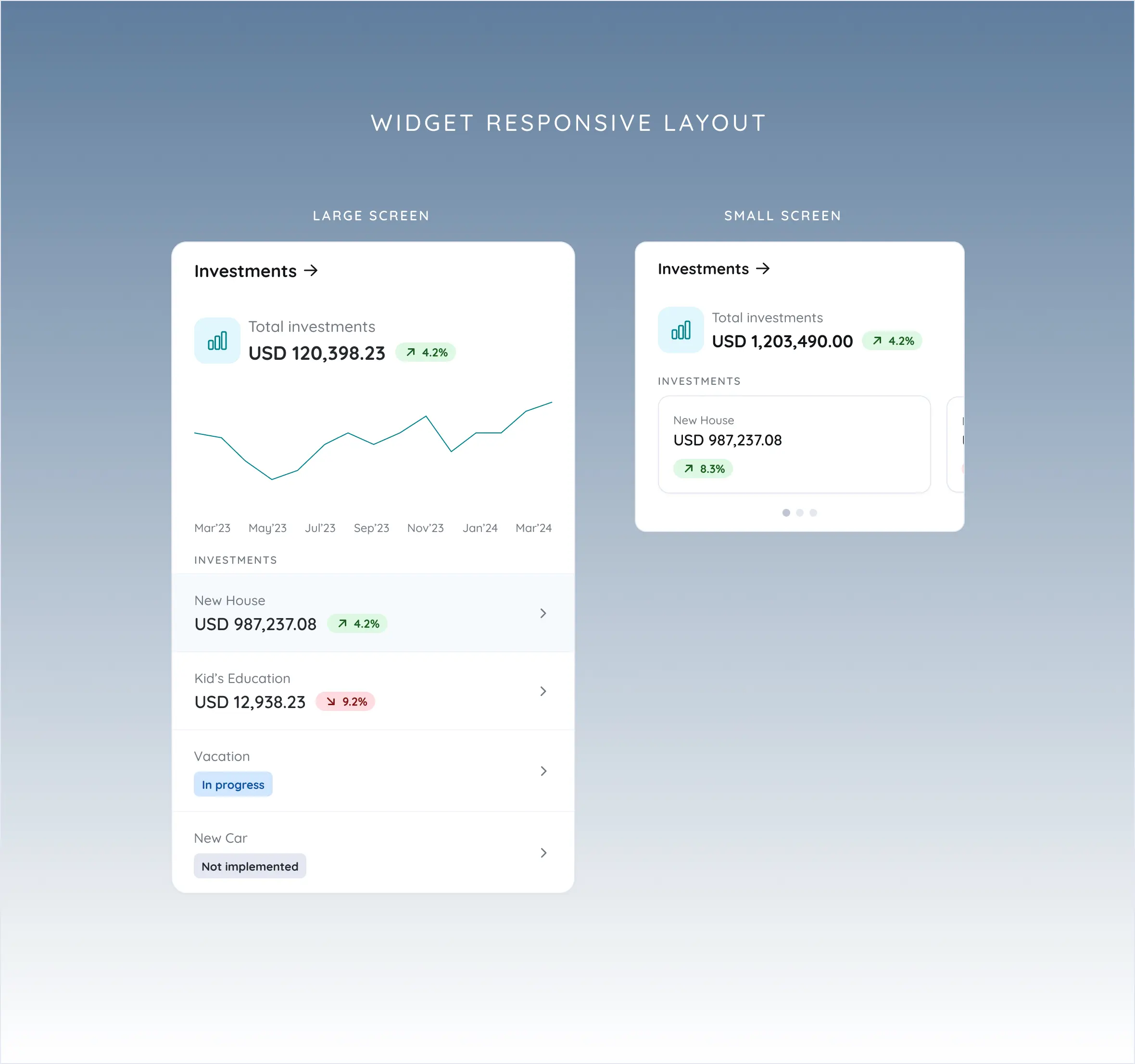
Mobile-first approach
I designed the platform with a mobile-first approach after research showed that most end users access the client portal on mobile devices. At the same time, the portal fully supports desktop use. The responsive design ensures a seamless and optimal user experience across all devices, whether users are on a smartphone, tablet, or desktop.
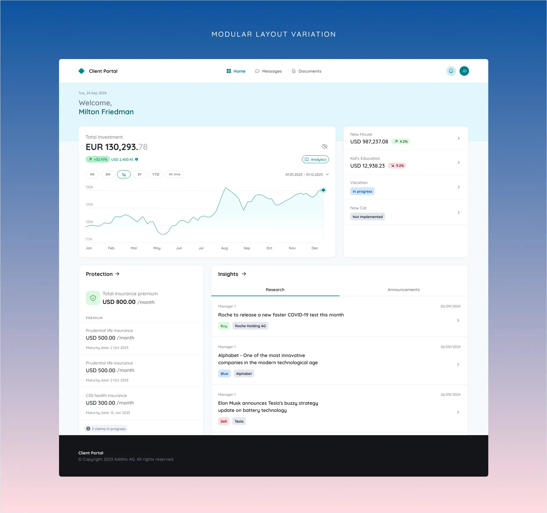
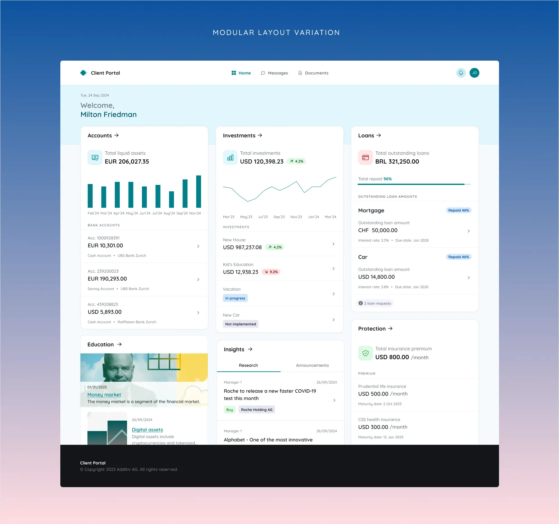
Modularity
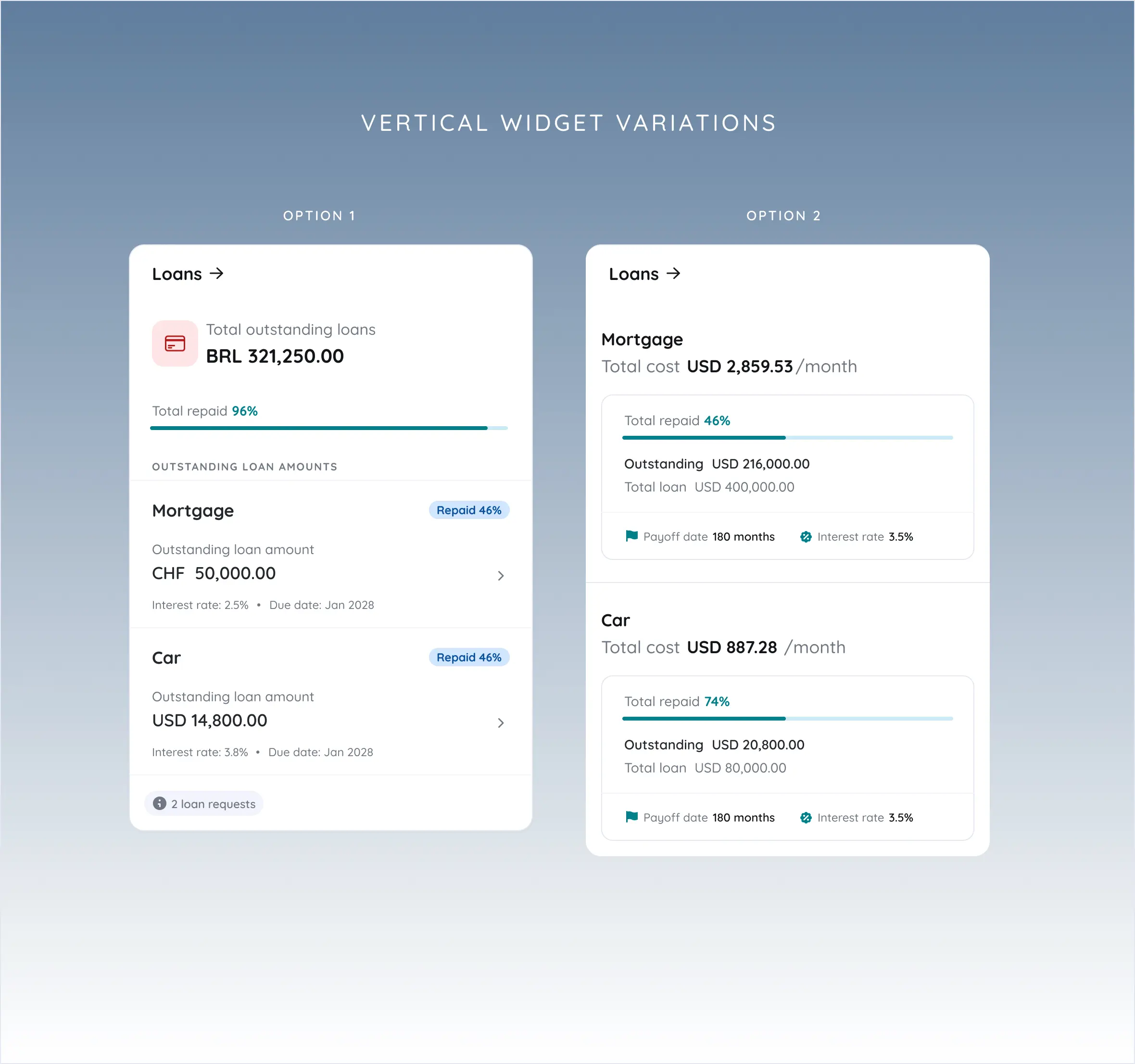
Applying modularity principles, I designed the platform to ensure flexibility across multiple verticals (banking, lending, insurance, and investment). Each vertical is represented as a configurable “widget,” allowing the system to adapt to different business use cases.
Businesses have the flexibility to show, hide, or add widgets, tailoring the portal to their specific needs while maintaining a consistent user experience.
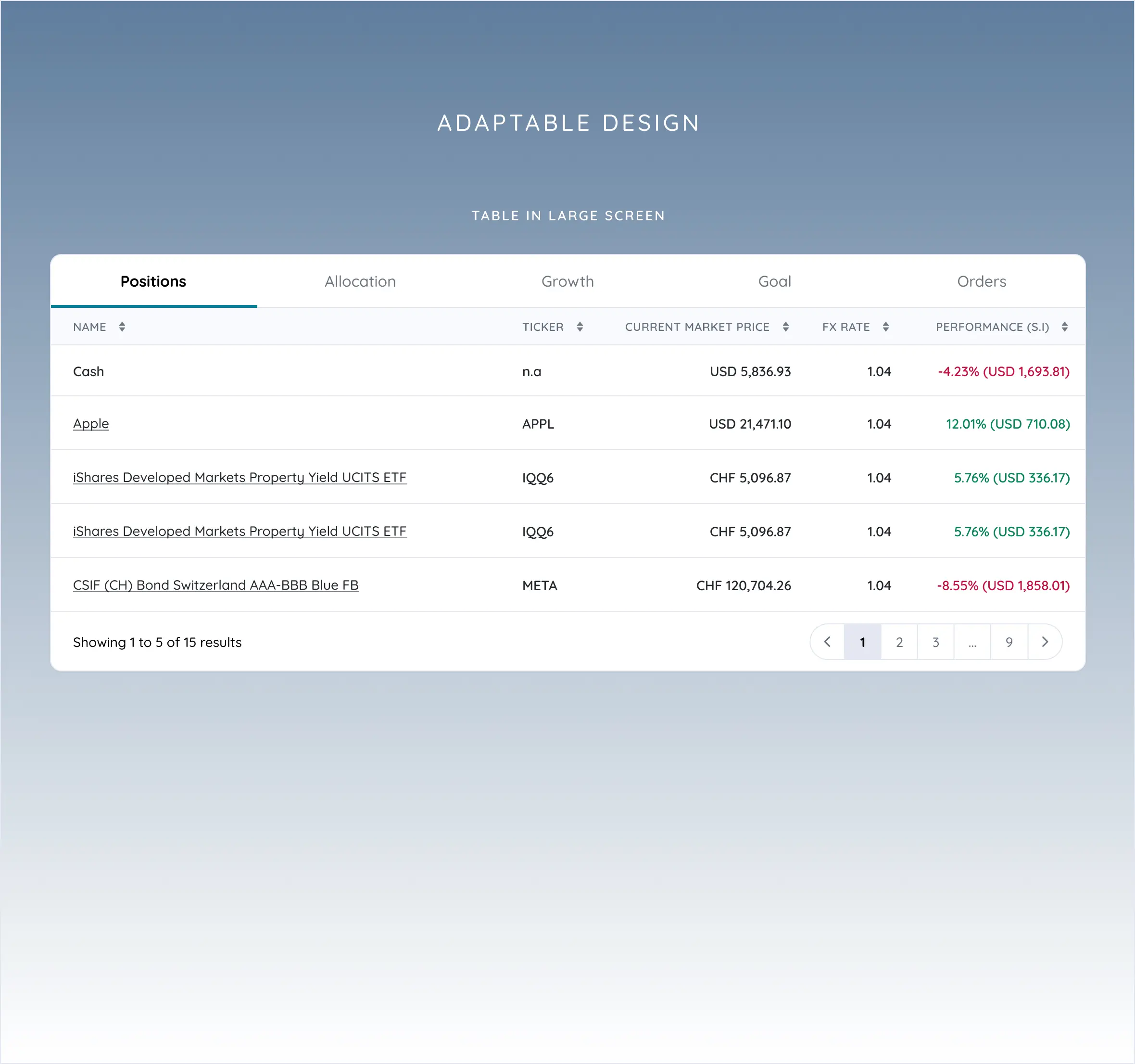
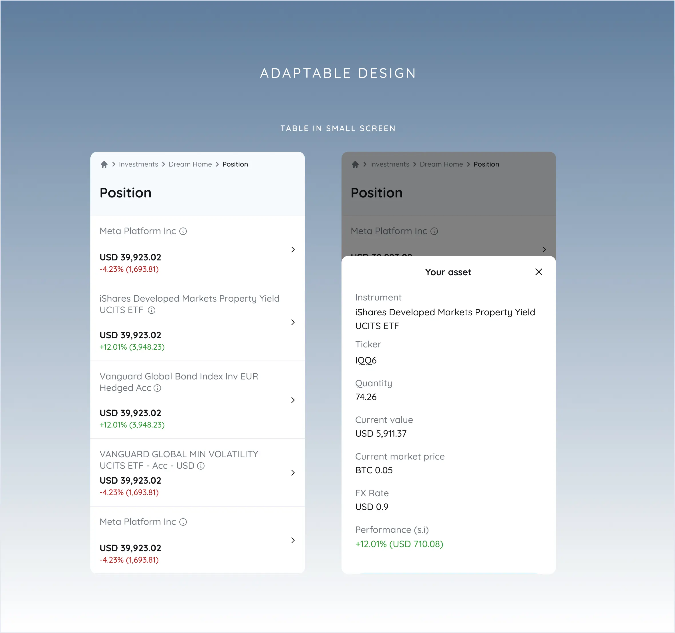
Adaptable Design
Every design element is crafted with user behavior and context in mind, how and where people interact with the platform.
My research revealed that user needs and interaction patterns differ significantly across devices: mobile users prefer quick, focused actions, while desktop users are more likely to explore and manage complex tasks. I designed a flexible interface that adapts to these behaviors, delivering an optimal user experience at every touchpoint.
Impact
Dispatch console was designed and build in 3 months and quickly become the main features from Zinier platform.
The console significantly enhances dispatcher efficiency and speed. Its new design is not only user-friendly but also come with minimal learning curve, thanks to the simple functionality making it easy to understand and use for existing or new user.
Read more about this in Zinier website
Zinier website 2025